I like this rule of thumb:
If you need the line to guide the eye (i.e. to show a trend that without the line would not be visible as clearly), you should not put the line.
Humans are extremely good at recognizing patterns (we're rather on the side of seeing trends that do not exist than missing an existing trend). If we are not able to get the trend without line, we can be pretty sure that no trend can be conclusively shown in the data set.
Talking about the second graph, the only indication of the uncertainty of your measurement points are the two red squares of C:O 1.2 at 700 °C. The spread of these two means that I would not accept e.g.
- that there is a trend at all for C:O 1.2
- that there is a difference between 2.0 and 3.6
- and for sure the curved models are overfitting the data.
without very good reasons given. That, however, would again be a model.
edit: answer to Ivan's comment:
I'm chemist and I'd say that there is no measurement without error - what is acceptable will depend on the experiment and instrument.
This answer is not against showing experimental error but all for showing and taking it into account.
The idea behind my reasoning is that the graph shows exactly one repeated measurement, so when the discussion is how complex a model should be fit (i.e. horizontal line, straight line, quadratic, ...) this can give us an idea of the measurement error. In your case, this means that you would not be able to fit a meaningful quadratic (spline), even if you had a hard model (e.g. thermodynamic or kinetic equation) suggesting that it should be quadratic - you just don't have enough data.
To illustrate this:
df <-data.frame (T      =         c ( 700,  700,  800, 900,  700, 800, 900, 700, 800, 900),
                 C.to.O = factor (c ( 1.2,  1.2,  1.2, 1.2,  2  , 2  , 2  , 3.6, 3.6, 3.6)),
                 tar    =         c (21.5, 18.5, 19.5, 19,  15.5, 15 , 6  , 16.5, 9, 9))
Here's a linear fit together with its 95% confidence interval for each of the C:O ratios:
ggplot (df, aes (x = T, y = tar, col = C.to.O)) + geom_point () +
    stat_smooth (method = "lm") +
    facet_wrap (~C.to.O)
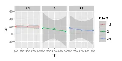
Note that for the higher C:O ratios the confidence interval ranges far below 0. This means that the implicit assumptions of the linear model are wrong. However, you can conclude that the linear models for the higher C:O contents are already overfit.
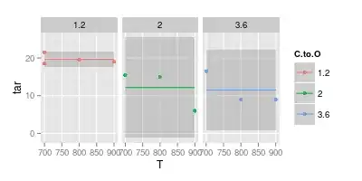
So, stepping back and fitting a constant value only (i.e. no T dependence):
ggplot (df, aes (x = T, y = tar, col = C.to.O)) + geom_point () +
    stat_smooth (method = "lm", formula = y ~ 1) +
    facet_wrap (~C.to.O)
The complement is to model no dependence on C:O:
ggplot (df, aes (x = T, y = tar)) + geom_point (aes (col = C.to.O)) +
    stat_smooth (method = "lm", formula = y ~ x)

Still, the confidence interval would cover a horizontal or even slightly ascending lines.
You could go on and try e.g. allowing different offsets for the three C:O ratios, but using equal slopes.
However, already few more measurements would drastically improve the situation - note how much narrower the confidence intervals for C:O = 1 : 1 are, where you have 4 measurements instead of only 3.
Conclusion: if you compare my points of which conclusions I'd be sceptical of, they were reading way too much into the few available points!

