Extensive edit of the original question while I've been able to refine my thoughts and write some better code.
Consider data from two processes, each with can produce many, many time series curves that will have lots of overlap in their results. An example image is below, using relatively few curves - the actual application has many thousands for each process whereas this only has 250 each (Red vs. Blue):
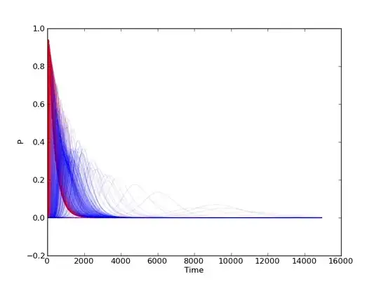
There will be a large amount of overlap between the two, but for example the "Red" process is the only one that can produce very high, very sharp peaks early on, whereas "Blue" seems to produce higher peaks in the X = 3000 to 4000ish range, etc. What I'm looking for is a way to statistically quantify or visualize that non-overlapping space where there's lots of overlap.
Anyone have any ideas? One thing I've considered doing is ignoring that these are time-series, and generating something like a kernel density for each and subtracting one from the other - areas far from zero would then be places of less overlap, but I'm not sure how defensible that is.
The actual application of this is a series of parameter searches for a dynamical system - essentially, the intent is to produce many, many numerical results of a system of differential equations using two different approaches, and then find anywhere in the results where, for example "Red can generate results with this value, whereas Blue cannot" when for the most part some parameter value for Red will provide the same results as a different parameter for Blue.