0

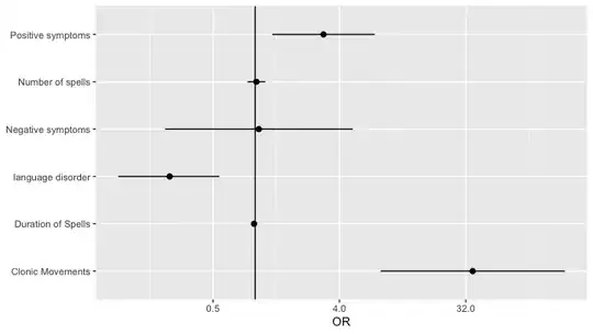
for a study i want to investigate which clinical symptoms of a patient, lead to the doctor stating a certain diagnosis (eg epilepsy). Ater using logistic regression to calculate the OR and 95% CI, I want to visualize the OR and 95% Ci in a forest plot. The problem however is that some symptoms have a very large OR and CI and some a small one, both being statistically and clinically significant. For example: clonic movements and language disorders (see below).

When plotted in a single figure (what i really want to do) the effect of language disorders is unreadable due to the large numbers of clonic movements. Any suggestion on how to visualize them in a different way? Tried using to take the natural log of all numbers, but then i come up with negative OR, which makes it even more unreadable?

Thanks in advance

Clinical symptom: OR + 95% CI

Number of spells 1.019 0.880- 1.181

Duration of Spells 0.982 0.966- 0.998

Positive symptoms 3.078 1.325- 7.151

Negative symptoms 1.062 0.227 – 4.980

Clonic Movements 35.8 7.876- 162.769

language disorder 0.245 0.105-0.553
2 Answers2

0

I think you are looking at this from the wrong perspective. First you need to understand why you get such a high odds ratio for one of your predictors. The usual explanation for this is a phenomenon called separation. I suggest you look at this Q&A How to deal with perfect separation in logistic regression? particularly the answer by Scortchi which is better, in my opinion, than the accepted one. If that solves your problem then fine otherwise edit your question with details of what you have done, what you found, and ask what to try next.

mdewey
  • 16,541
  • 22
  • 30
  • 57
  • I agree that understanding a fitted model is important, and I don't know the details of the analysis any more than you, but my reaction isn't necessarily that there is something numerically amiss here. If I backtransform the confidence interval for 'Clonic movements', I get an estimated log-OR of 3.57 and a standard error of 0.78. This seems fine to me. – psboonstra Aug 13 '20 at 14:10
  • 1
    @psboonstra yes I agree it is more like quasi-separation. I suspect clonic movements in the OPs data-set were almost diagnostic of epilepsy but the OP must know that better than we do. – mdewey Aug 13 '20 at 14:51
  • Thank you both, indeed clonic movements are almost pahtognomical for the diagnosis epilepsy in this dataset. Will try your suggestion psboonstra. – user14092224 Aug 14 '20 at 11:17
0

Plot the ORs and their confidence intervals on the log scale, but label the axis on the natural scale, as in:

require(tidyverse)

plot_dat <- 
  tribble(
    ~variable, ~or, ~or_low, ~or_high,
    "Number of spells",1.019,0.880,1.181,
    "Duration of Spells",0.982,0.966,0.998,
    "Positive symptoms",3.078,1.325,7.151,
    "Negative symptoms",1.062,0.227,4.980,
    "Clonic Movements",35.8,7.876,162.769,
    "language disorder",0.245,0.105,0.553)

ggplot(plot_dat) +
  geom_vline(xintercept = 1) + 
  geom_point(aes(x = or, 
                 y = variable), 
             size = 2) +
  geom_segment(aes(x = or_low,
                   xend = or_high,
                   y = variable, 
                   yend = variable)) +
  scale_x_continuous(name = "OR", 
                     trans = "log2") + 
  scale_y_discrete(name = NULL)

enter image description here

psboonstra
  • 1,745
  • 7
  • 12
  • Thanks for your answers. i will try this option. The occurence of clonic movements is indeed high associatied almost pathognomic for epilepsy. So the outcome was indeed expected from a clinical perspective as well. – user14092224 Aug 14 '20 at 11:07