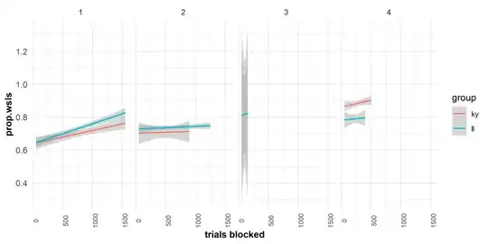
I have made the graph below which shows the SE area around lines. However, I can't work out why they are so large for the 3rd graph.
Graph code:
  dg10<-summarySE(vtrs, measurevar="prop.wsls", groupvars =c("t_blocked","attempts","group"))
  t <- ggplot(data=dg10, aes(x=t_blocked, y = prop.wsls,colour=group))+
    theme_minimal()+
    theme(axis.text = element_text(size = 15)) +
    theme(axis.title.y = element_text(face="bold")) +
    theme(axis.title.x = element_text(face="bold")) +
    theme(axis.text.y = element_text(size=10)) +
    theme(axis.text.x = element_text(size=8,angle=90)) +
    geom_smooth (method= 'lm',se=TRUE,size=0.7)+
    facet_grid(~attempts)+
    xlim(50,1550)
When I calculate the SE using the describe function, it returns the below. As you can see from the last column I expected the se area in the graph to be larger for #3, but I think it seems far too big given it's ratio to the other levels.
describeBy(vtrs$prop.wsls,group=vtrs$attempts,mat=TRUE,digits=5) # displays SE

    item group1 vars     n    mean      sd median trimmed mad min max range     skew kurtosis      se
X11    1      1    1 15389 0.69556 0.46018      1 0.74442   0   0   1     1 -0.84987 -1.27780 0.00371
X12    2      2    1 10768 0.72901 0.30986      1 0.76619   0   0   1     1 -0.69631 -0.49109 0.00299
X13    3      3    1   873 0.81558 0.23292      1 0.85598   0   0   1     1 -1.00873  0.24935 0.00788
X14    4      4    1  1719 0.84540 0.18898      1 0.87509   0   0   1     1 -1.05780  0.61456 0.00456
What I'm unsure of is whether the graph is correct and therefore to understand why it comes out so large in the graph. Particularly, why is the standard error around the lines so much larger than the values reported in the 'describe' table. OR if I am making some mistake here, either in my code or understanding of SE.
Any help would be massively appreciated!
