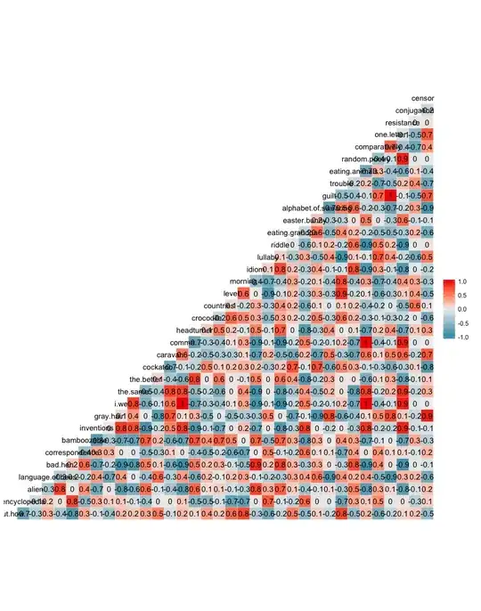
Such graphs often disappoint in practice as compared with the ideal that they might show interesting or helpful patterns.
First is the problem of over-plotting. Two or more pairs (expected, observed) will necessarily plot at the same position. Your observed frequencies are necessarily integers; your expected frequencies show some granularity too, so overlap may be common, especially in large datasets.
So, what to do about that?
Jitter points by adding random noise graphically.
Change the symbol. Dots are hard work at best (I find your image hard to read). Although it has become unfashionable in some groups for some reason, the ancient advice to use open symbols like hollow circles still seems good to me. They tolerate overlap well: think Olympic rings or marks from beer or wine glasses.
Consider showing frequency at each position by different symbol sizes. Proportionality isn't essential: in fact about 7 classes on a logarithmic scale can work fine.
Second, sometimes square root scales work well for plotting counts or similar variables. It's elementary but also fundamental that the square root of zero is zero and that square root transformations can work well with counts (which hangs with the variance of a Poisson equalling its mean).
Third, you are relying on colour alone to make distinctions. Changing the symbol too could help. But what happens if functional, phylogenetic and random plot at the same position? (I have no real idea of what those categories mean, but evidently the categories are expected to be different.) See Visualising many variables in one plot for the suggestion to plot each group in turn with the other groups as backdrop.
