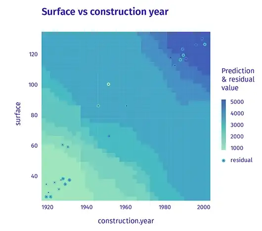
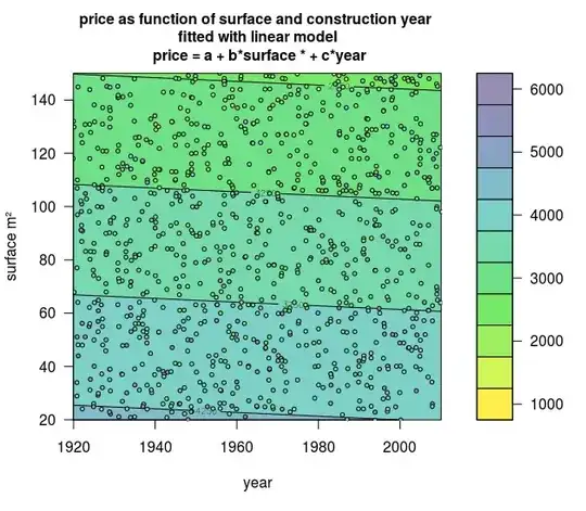
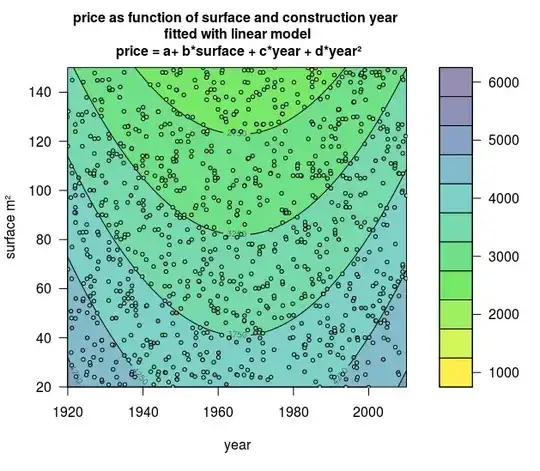
The following visual certainly delivers in terms of eye candy:
There was no details on the model specification, but let's just assume its something like:
$$price = \beta_{0} + \beta_{1} x_{surface} + \beta_{2} x_{cyear} + \epsilon$$
Where:
- $price$ - the selling price of a house
- $x_{surface}$ - the surface area of the house
- $x_{cyear}$ - the year the house was constructed
Edit
After much effort, I found a way to iterate through the domain of the variables age and area using coefficients to get prediction values. I left out residuals for simplicity. Here is my code:
c = 20595
area = 39.28
age = -402.5
master_array = []
step = 50
x_range = 3800
y_range = 50
for i in range(step):
    for j in range(step):
        temp = {}
        temp['x'] = i*(x_range/step)
        temp['y'] = j*(y_range/step)
        temp['pred'] = c+((i*x_range/step)*area+(j*y_range/step)*age)
        master_array.append(temp)
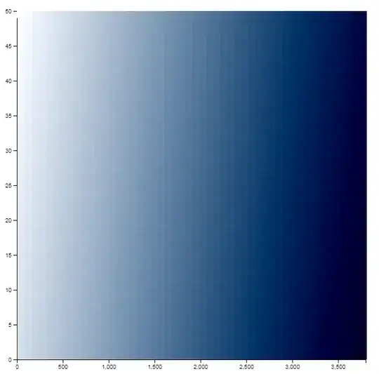
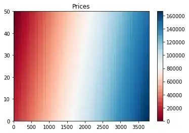
I have made modest progress. The constant and coefficients age and area I obtained after I ran a regression using the above specification on a data set from my econometrics text book. Clearly, the output should not be expected to be exactly the same as the inspiration visual, but I didn't get anywhere near the spread of prediction regions. Mine looks simply like a gradient. Output below, age is y axis, area is x axis, light blue=cheap house, dark blue= expensive house:
I'm concerned there is a flaw in my code. Quick inspection led me to notice there appears to be no negative relationship of age shown in the plot (we would expect more darker blue regions where age is close to 0. Maybe someone with experience with this type of visual can advise on my implementation.
Question
Can we expect OLS estimation to only have a 'boring' linear gradient for prediction regions, as seen in my visual, or maybe it's user error on my part? Either way, what type of estimation could explain the 'cool' / 'interesting' prediction zones seen in the inspiration visual?
