2

I would like to analyze a small matrix N (8 cases) x M (6 variables) whose values are the number of responses each case get on the different variables. These values have a very different scale because each case had a very different exposure, thus the number of responses are cleary very different in size. My aim is to find the distinctive characteristics (the "profiles" we can say) of each case with regard to the variables, and comparing the analysis results with a theoretical typology.

My first approach was to calculate the proportion for each case in order to normalize the values in a comparable scale (after this step I ended up with a matrix N x M containing proportions, with each row that adds up to 1) and then apply a Principal Component Analysis (PCA) in order to discover the most characteristic relations that link the cases to the variables, also discovering the main factors underlying the variables, which I try to interpret with the aid of my theoretical typology.

I already discovered that proportions are not appropriate for PCA analysis, but there are also "robust" PCA to analyze "compositional data" (the proportions). However, I am not specifically trained in statistics, and I am sure that there is some better and more correct approach to use for this case.

You can find here the data

Can someone help me? Thanks
kk68
  • 37
  • 6
  • A stem and leaf plot would be a simple and good start. I am not clear that you need anything here but simple machinery. Why not list the data? – Nick Cox Feb 27 '20 at 17:37
  • Hi, I've added the [link to the data](https://docs.google.com/spreadsheets/d/1nc7raEarIc7yi0GEcbLiCEHav_iiJ2yd_yk0NhmenAQ/edit#gid=0) – kk68 Feb 27 '20 at 17:57

1 Answers1

3

There is no clue here about what the data mean, but some exploratory rules of thumb often work for me, so here goes.

  1. Above all else, plot the data first.

  2. Positive values over several orders of magnitude usually mean working on logarithmic scale.

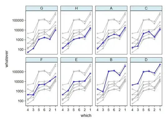
  3. Order to reflect order. Here the order of the variables by their medians and of the individuals by their medians across variables seem to make sense (and using medians marches with logarithmic scale more easily than using means). (Geometric means would be fine by me too.)

enter image description here

The graph is what I now call a front-and-back plot in which each individual's profile across variables is shown against a backdrop of all the others. The idea of such deliberate repetition is to reduce the spaghetti problem of tangled traces difficult to tease apart mentally. See also this thread for several references and wider discussion.

For the record, here is Stata code. The first few lines may be easier for some readers to modify for their favourite software than the source given by the OP (which is more likely to rot).

clear 
input str1 id V1    V2  V3  V4  V5  V6
A   18333   2678    527 118 2101    3682
B   385072  44235   873 1670    113472  135763
C   11939   1885    223 164 4278    7175
D   579816  74803   6066    4416    98212   111898
E   67535   11275   1208    444 9602    10343
F   30601   11098   426 441 4686    5004
G   9743    1128    127 52  1105    1745
H   15450   2006    401 138 1088    1489
end 

reshape long V, i(id) j(varno)
bysort varno : egen median1 = median(V) 
egen newvarno = group(median1 varno) 
labmask newvarno, values(varno) 
bysort id : egen median2 = median(V) 
egen newid = group(median2 id) 
labmask newid, values(id) 
fabplot connected V newvarno, by(newid, col(4)) ysc(log) xla(1/6, valuelabel) ///
yla(1e5 1e4 1e3 1e2, ang(h)) frontopts(lw(medthick)) xtitle(which) ytitle(whatever) 
Nick Cox
  • 48,377
  • 8
  • 110
  • 156
  • 1
    Thank you very much, your approach is really interesting, useful and somehow "inspiring" to me. I think it would complete the analysis a method to cluster toghether the similar "profiles". I'll take a look to the papers you cited in the other post. – kk68 Feb 27 '20 at 19:39