I have used R programming language to perform Wilcoxon signed ranked test between two data:
47.96       13.8
23.44       25.84
38.98       31.84
15.45       18.87
18.91       19.46
45.21       38.47
21.16       10.17
13.14       11.61
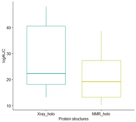
The graphical representation of the result is showed in photo.
I am trying to understand how it is decided what will be the box range.
I understand that the horizontal lines on the graph are median values, while vertical lines on the graph present the range of my data, but I am curious what box range represents?
So in my case although there is no significant difference between two median values, the box range in the graph is very different.
This is the code I used:
#my_data <- read.csv(file.choose())
# Data in two numeric vectors
# ++++++++++++++++++++++++++
# Weight of the mice before treatment
Xray_holo <-c(47.96, 23.44, 38.98, 15.45, 18.91, 45.21, 21.16, 13.14)
# Weight of the mice after treatment
NMR_holo <-c(13.8, 25.84, 31.84, 18.87, 19.46, 38.47, 10.17, 11.61)
# Create a data frame
my_data <- data.frame(
  P_str = rep(c("Xray_holo", "NMR_holo"), each = 8),
  logAUC = c(Xray_holo,  NMR_holo)
)
print (my_data)
install.packages("dplyr")
library("dplyr")
group_by(my_data, P_str) %>%
  summarise(
    count = n(),
    median = median(logAUC, na.rm = TRUE),
    IQR = IQR(logAUC, na.rm = TRUE)
  )
# Install
if(!require(devtools)) install.packages("devtools")
devtools::install_github("kassambara/ggpubr")
install.packages("ggpubr")
# Plot weight by group and color by group
library("ggpubr")
ggboxplot(my_data, x = "P_str", y = "logAUC",
          color = "P_str", palette = c("#00AFBB", "#E7B800"),
          order = c("Xray_holo", "NMR_holo"),
          ylab = "logAUC", xlab = "Protein structures")


#install.packages("PairedData")

# Subset weight data before treatment
#Xray_holo <- subset(my_data,  P_str == "Xray_holo", logAUC,
                 drop = TRUE)
# subset weight data after treatment
#NMR_holo <- subset(my_data,  P_str == "NMR_holo", logAUC,
                 drop = TRUE)
# Plot paired data
#library(PairedData)
#pd <- paired(Xray_holo, NMR_holo)
#plot(pd, type = "profile") + theme_bw()


res <- wilcox.test(Xray_holo, NMR_holo, paired = TRUE)
res
