-3

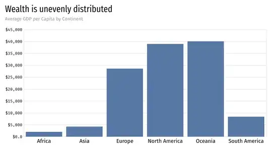
The following bar chart is one of the most commonly drawn, and yet I cannot find any dedicated name for it. It uses a categorical independent variable (dimension) for the horizontal axis and a numerical dependent variable (measure) for the vertical axis. The numerical dependent variable is the result of an aggregation like a sum or average (like in the following example).

enter image description here

Some people mistakenly call this a histogram, but it is not one, for a histogram is an estimate of the probability distribution of a continuous variable (Source: Wikipedia), and there is no continuous variable to which the categorical dimension used for the horizontal axis can be associated.

This chart is closely related to a frequency chart, but it is not one in most instances (like this one), for the vertical axis does not always visualize a frequency, it visualizes an arbitrary aggregation. Of course, this aggregation could be a count, in which case we would have a proper frequency chart indeed, but it could also be a sum, an average (as is the case in the chart above), a median, or any other summary statistic.

For that reason, I like to call it a summary chart, but I wonder if there is a more established name that I could use instead. And it goes without saying that bar chart is not a valid candidate, for it is not specific enough: histograms and frequency charts are all specific types of bar charts (in my opinion), or look way too much like one (if you believe that a histogram is not a specific type of bar chart).

Bar plot would be a last resort option, but there is no well-accepted delineation between chart and plot. For most people, these two terms are synonyms. Furthermore, I tend to believe that plot should be reserved for visualizations depicting independent observations (raw data) instead of the results of aggregations, but this is a rather personal preference. For example, the following bar plot depicts the height of the tallest building within each country, and this visual is produced from a list of countries with Name and Tallest Building Height as variables, instead of a list of buildings with Country and Building Height as variables. A similar visual could have been produced for the latter dataset using a MAX aggregation, and this visual would be called a summary chart. But because the following visual is not the result of any aggregation (as far as the source dataset is concerned), it is not a summary chart, and while it is a bar chart, I call it a bar plot to be more specific.

enter image description here

Bar graph shares the same problems as bar plot, and I tend to avoid using the term graph for visualization, for it could create confusion with the field of graph theory. Trained statisticians know how to make the difference, but your casual user might get confused, and I treat this casual user as my primary audience for this terminology.

Column chart is not a desirable candidate either, because it is a synonym for vertical bar chart, and it does not convey any statistical meaning, unlike summary chart.

Why do we need a name for that chart? So that we can distinguish it from other charts that look similar but are different (histogram or frequency chart for example). Does it mean that we will need different names for different aggregations? Probably not, because summary chart is clear enough.

But will that make the term frequency chart redundant then, since it would refer to a particular type of summary chart for a particular summary statistic? No, because the frequency chart is a very particular (and important) summary chart, since it is using a very specific type of aggregation (count) that can be used with a single categorical variable, unlike sum or average for example, which require both a categorical variable (the dimension) and a numerical variable (the measure).

To summarize, in my proposed terminology:

  • A summary chart is a particular type of bar chart.
  • A frequency chart is a particular type of summary charts.
  • Most summary charts are not frequency charts (they visualize aggregations other than count).
  • A histogram is a particular type of bar chart.
  • A summary chart is not a histogram.
  • A histogram is not a summary chart.
  • A summary chart is called that way because it visualizes a summary statistic.
  • Not all charts visualize summaries on data (scatter plots do not for example).
  • Many charts visualize summaries on data but have nothing to do with a summary chart.
  • Terminology matters, and I do not think that I have to explain why.
Ismael Ghalimi
  • 1,968
  • 2
  • 12
  • 21
  • 10
    Why does it need a special name? It's just a bar chart. – gung - Reinstate Monica Jan 03 '20 at 18:46
  • Because it has a specific meaning, like a histogram or a frequency chart. Why do these need specific names? They're all bar charts after all, aren't they? In fact, we could call all charts just that: charts. Much like we could call all people Person. But I'd rather be called by my name, and so does that chart. – Ismael Ghalimi Jan 03 '20 at 18:49
  • 6
    A histogram is not a bar chart, it can just look like one. Should we have different names for every aggregate that can be made (count chart, sum chart, mean chart, etc)? This is a bar chart of means for different regions. That's it. – gung - Reinstate Monica Jan 03 '20 at 19:00
  • 2
    An older terminology (which I don't recommend, because I don't see the logic and I think it's fading away) is that a bar chart means _horizontal_ bars, whereas a column chart is one that uses vertical bars. Otherwise, I am with @gung-ReinstateMonica, but add the gloss that although geometrically a histogram is a bar chart, statistical people won't willingly call a histogram a bar chart. This is up there with jam and, marmalade (for British people at least, marmalade is not jam). – Nick Cox Jan 03 '20 at 19:05
  • More importantly, pfui to Wikipedia. I am more than happy to extend the name histogram to bar or even spike representations of discrete variables that are counts; not quite so happy about ordinal or nominal variables. But insisting that the term histogram is, or even should be, only used for continuous variables doesn't seem to match usage by competent people or to possess helpful logic. – Nick Cox Jan 03 '20 at 19:08
  • 1
    "Bar" vs "column" is completely arbitrary & nonsensical, @NickCox. Let's not get into jam vs marmalade, though, [wars have been started for less](https://www.youtube.com/watch?v=7ka6Ti6Rw0k). – gung - Reinstate Monica Jan 03 '20 at 19:09
  • A Google for column chart finds distressingly many mentions. – Nick Cox Jan 03 '20 at 19:11
  • Column chart should be a synonym for "vertical bar chart". It does not convey any statistical meaning, unlike "summary chart". – Ismael Ghalimi Jan 03 '20 at 19:14
  • Many people would disagree with the fact that a histogram is not a bar chart. Visually speaking, it really is. I am looking for a name that is not yet in common use and is statistically relevant. I have updated the original question with some reasons why we might want to use such a name. – Ismael Ghalimi Jan 03 '20 at 19:16
  • 2
    Back to the original question: bar chart was my instant response, and I have no reservations about that. I have come across the argument that _graph_ is bespoke to _graph theory_, which is nonsense historically and implausible any way. Any one who knows what graph theory is will **not** be confused if graph also means chart or plot. – Nick Cox Jan 03 '20 at 19:19
  • 1
    A few people have tried to distinguish systematically between e.g. plots and charts -- see Harris's extraordinary book https://dl.acm.org/doi/book/10.5555/519400 -- but usage is too haphazard to make any distinction convincing. A lengthy phase in which chart and/or -gram and/or diagram were favoured suffixes or second words has given way to a preference in recent decades for plot in that role. – Nick Cox Jan 03 '20 at 19:21
  • "it goes without saying that bar chart is not a valid candidate": It really doesn't go without saying. – Nick Cox Jan 03 '20 at 19:23
  • Now we're talking! Harris's book is awesome indeed, but I don't think it settled the question. And the "chart", "plot", "graph", and "gram" suffixes are too ambiguous and legacy-loaded to be of any help indeed. Along the same lines, I've tried to make a classification with http://stoic.com/principia/pictura.pdf on top of an algebraic data typology: http://stoic.com/principia/data.pdf. I thought I had most of the bases covered until I realized that I was missing a term for the chart depicted in the question. – Ismael Ghalimi Jan 03 '20 at 19:26
  • I really think that "it goes without saying" that a histogram is a bar chart. If we take a random sample of chart designers, show them a histogram without any labels or titles, and ask them whether this is a bar chart or not ("yes", "no", "maybe" being the only possible answers), I am willing to bet that over 80% will answer "yes". – Ismael Ghalimi Jan 03 '20 at 19:29
  • 5
    No, that first claim is incorrect, although it's a commonly held belief (and so the second claim about 80% may be correct!) (And let's not get started about the deficiencies of "chart designers" ...) Histograms depict values by means of *areas* whereas bar charts depict the values by means of *lengths.* They may appear to be the same, whence the confusion. See, for instance, Freedman, Pisani, & Purves, *Statistics* (any edition). – whuber Jan 03 '20 at 19:54
  • 1
    Such graphs should not be used as the area of the bars has no meaning whatsoever. – Xi'an Jan 04 '20 at 08:27
  • A side point, but I will make it any way. The order of the bars in each case is alphabetical, by country name. That is a common default in software, but you'd be better off using an ordering by magnitude if you have no other criterion. – Nick Cox Jan 04 '20 at 08:48
  • 1
    What to call this remains to me at most a very small problem. In practice if I were reviewing this in student work or a submission to a journal I would be happy with wording such as "Figure 7 is a bar chart showing mean GDP pc by continent" or even "Figure 7 shows mean GDP pc by continent". If your readership doesn't know what a bar chart is, then you do have a problem. – Nick Cox Jan 04 '20 at 08:52
  • @Xi'an I respectfully disagree with that statement. With bars of constant width, the area is proportional to the length, itself proportional to the value, giving perfect meaning to these bars. I do not believe that there is any significant disagreement on that point within the data visualization community. – Ismael Ghalimi Jan 04 '20 at 16:21
  • @NickCox I totally agree with you regarding sorting. And if you want to go there, I would argue that a summary chart with bars sorted by decreasing values would deserve an even more specific name in order to put emphasis on the fact that such sorting was applied. – Ismael Ghalimi Jan 04 '20 at 16:23
  • @NickCox I believe that any member of this readership thinks he or she knows what a bar chart is, but is also very confused about the different kinds of bar charts that are being produced, and would be utterly confused to read that a histogram is not a bar chart. In other words, in visualization theory, a bar is a mark, and a chart is a visual that aligns marks alongside axes in relation to values. With such a definition, a histogram is a bar chart. But it has a radically different meaning than the summary chart that is drawn in the article. – Ismael Ghalimi Jan 04 '20 at 16:25
  • @NickCox Furthermore, I like to believe that nobody really understands charts until they understand the difference between independent variables and dependent variables, which itself relates to independent axes and dependent axes on a chart. For example, a scatter plot has two dependent axes and expects two dependent variables to be produced. I want to emphasize this notion through the use of a proper terminology, hence the introduction of the term "bar plot". – Ismael Ghalimi Jan 04 '20 at 16:29
  • @NickCox Overall, I am a bit surprised by the negativity of the reaction to this post. My desire for a clear terminology is driven by a desire to help people better understand data visualization, and I am not proposing to "remove" any terminology in use today. For example, anyone could still use the term *bar chart* while using the terms *summary chart* or *bar plot* as more specific instances of *bar charts*. And my proposed terminology does not even mandate that one agrees or disagrees with the fact that a *histogram* is a specific type of *bar chart*. – Ismael Ghalimi Jan 04 '20 at 16:33
  • @NickCox Regarding sorting, it seems that the [Financial Times Visual Vocabulary](https://github.com/ft-interactive/chart-doctor/tree/master/visual-vocabulary) agrees with the need for dedicated names, calling the charts *ordered bar* and *ordered column*. Of course, my recommendation would be to use *ordered summary chart* instead. – Ismael Ghalimi Jan 04 '20 at 17:09
  • 1
    Asking a question in any forum like this sometimes leads to reactions that surprise or disappoint the OP. People are allowed to disagree with you on the importance of this question. I won’t try to respond in detail, but it seems that you’re — in part — tilting at suggestions no respondent ever made or would endorse. Why not consolidate your comments into an answer? Unfortunately I see no value to the term _summary chart_ but it must stand or fall on how widely it appeals to others. – Nick Cox Jan 04 '20 at 17:43
  • @NickCox I agree. Thanks a lot for the clarification, this is really helpful. Now, the need for a term like *summary chart* is only the tip of the iceberg. I invite you to take a look at my new answer to the original question, which brings light to a much broader question regarding the definition of the *histogram*, and by way of consequence to our collective understanding of what a *bar chart* really is. – Ismael Ghalimi Jan 04 '20 at 17:46
  • 2
    Rather then asking question you seem to be rather *arguing for some terminology that you prefer*. Your question was already answered be several people: this plot **is** called "bar chart" and has nothing to do with histogram. Please avoid prolonged discussions in comments, such discussions would be moved to chat. Comments are not meant for discussions, neither are the questions, nor answers. – Tim Jan 04 '20 at 21:53
  • @Tim Fair enough. I am defeated. Feel free to call it what you want. This clearly is not the proper venue for this type of work. Sorry for the noise. – Ismael Ghalimi Jan 04 '20 at 21:57
  • I'm not sure this question is unanswerable though, it shouldn't be closed. The name for the bar charts in the OP is, objectively, "bar chart". – Firebug Jan 25 '20 at 15:46
  • @Firebug I appreciate the comment, but I don't think CV is the right venue for this type of research work. If you're interested by this topic, you might like this [article](https://www.linkedin.com/pulse/designing-bar-chart-likes-stoic-ismael-chang-ghalimi/). This [article](https://www.linkedin.com/pulse/designing-line-charts-like-stoic-ismael-chang-ghalimi/) on line charts and this other [article](https://www.linkedin.com/pulse/designing-area-charts-like-stoic-ismael-chang-ghalimi/) on area charts are also full of surprises. With charts, there is a lot more than meets the eye... – Ismael Ghalimi Jan 25 '20 at 18:15

1 Answers1

1

The comment from @whuber to this question is correct. The chart in question is not a histogram though if the same visualization showed different data it could be a histogram.

A histogram doesn't have categories. It shows data continuously, in degrees, amounts or some other measurement. This could be modified to be a histogram by changing the input data. If it showed average GDP by degrees longitude (ordinal data) that could be displayed as a histogram. Continents (nominal data) however are not a measurement of degree or amount.

I would avoid the term frequency as it implies a rate over time.

This chart is:

  • a nominal data bar chart
  • a bar chart showing average GDP per capita by continent
  • clear, that is, one who understands the data labels can understand the chart
  • a visual summary of the data
  • not a histogram
ChrisB
  • 119
  • 4
  • 3
    Overall correct, but I disagree that a histogram doesn't have "buckets" - you have to have some way to group the continuous variable. What a histogram does *not* have is *categories*, which are natural, pre-defined, unordered groups like continent or hair color. If you want to make a histogram of population age, for example, you could bucket people by age decade, but those bucket cutoffs are completely arbitrary. A histogram requires a way to group (bucket) data points, it's just that those groups are not pre-defined by the type of data you're analyzing. – Nuclear Hoagie Jan 03 '20 at 21:39
  • 1
    To be clear, the chart drawn in the question is not a frequency chart. It is a summary chart. The frequency chart is also a summary chart. A summary chart is a particular type of bar chart. And a frequency chart is a particular type of summary chart (in my proposed terminology that is). – Ismael Ghalimi Jan 03 '20 at 22:09
  • 1
    Also, not all chart summarize data. A scatter plot does not for example. – Ismael Ghalimi Jan 03 '20 at 22:10
  • @Ismael good point. Amending my answer to reflect that. – ChrisB Jan 03 '20 at 22:12
  • 1
    @ChrisB Awesome! I have updated my article with a summary of critical points in order to clear out any misunderstanding. – Ismael Ghalimi Jan 03 '20 at 22:16
  • 1
    @Nuclear thanks for the clarification. I agree with your comment. “Buckets” is a poor choice of words since a histogram displayed as a bar chart necessarily groups data into ranges of values. I changed the wording in my answer to use “categories” instead. – ChrisB Jan 03 '20 at 22:22