9

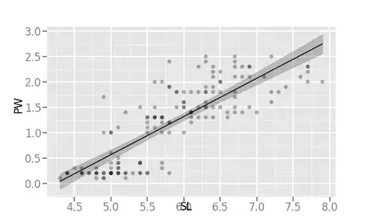
I am using ggplot with Python for showing regression/correlation. With method='lm' (means "linear model"), I get following graph:

enter image description here

And with method='loess', I get following:

enter image description here

The width of SE area is much wider with loess method than with lm method. Is this expected or is there an error somewhere?

Following is Python code to get above figures:

from ggplot import *
print (ggplot(aes(x='SL', y='PW'), data=irisdf) + \
    geom_point(alpha=0.3) + \
    stat_smooth(colour="black", se=True, method='lm')) 
    # or method='loess' in above line
plt.show()
rnso
  • 8,893
  • 14
  • 50
  • 94
  • lm = "linear model". In R, the call for linear regression is `lm(...)`, so this method is very clear to R users, may be not so much to Python users. – Cliff AB Jan 02 '20 at 21:28
  • Thanks. Corrected from 'linear method' to 'linear model' in question above. – rnso Jan 03 '20 at 01:03

2 Answers2

8

This is straight up expected behavior for LOESS/LOWESS (and other scatterplot smoothers/nonparametric regression methods).

LOESS (LOcally Estimated Scatterplot Smoother) more or less estimates the value of y using only some fraction of the x observations for a small stretch of x values, it repeats that estimation by shifting that 'small stretch' until all observed values of x have been covered. The result is:

  • Not assuming a linear relationship between y and x, and (importantly for your question)
  • Less confidence about the line of estimates.

A few additional points

  1. This greater uncertainty about the line of estimates does not mean that nonparametric regression must have lower power than the corresponding linear regression: that is only true if the relationship between y and x is approximately linear (examine the size of the individual residuals from the best fitting straight line through a scattering of y data nonlinearly related to x to get a sense of why).

  2. LOESS and LOWESS, along with GAMs and other nonparametric regression models all rely on the 'small stretch' of x values mentioned above. This can be expressed as 'bandwidth' or 'span' (which describe the proportion of the observed total range of x values to be included in each estimation), or 'k nearest neighbors' (an absolute number of observed points on the x axis to include).

  3. When trying to decide whether to use a linear or nonparametric regression model I start with the latter, and ask whether a straight line will fit within the confidence band of the nonparametric regression; if yes, then I proceed to use linear regression, if no, I am done, unless I need parametric estimates for some reason (e.g., statistical inference, communication of model results, model transport to a different data set) in which case I proceed to use nonlinear least squares for a reasonable functional form as informed by the shape of the nonparametric model. NB: I am leaving a lot out about various parametric curve-fitting approaches here.

Alexis
  • 26,219
  • 5
  • 78
  • 131
  • 1
    Is linear fit all right for above data or you want to use some nonlinear least squares method here? – rnso Jan 02 '20 at 05:46
  • On the "straight line" plot the right-hand side data is below the straight line, this is why the loess curve bends. I extracted data from the plot for analysis, and found that the simple equation "y = a / x + offset" gives a better fit to the data with coefficients a = -2.4352163295029627E+01 and 0ffset = 5.4704380431134823E+00 yielding R-squared = 0.643 and RMSE = 0.445. While not an ideal fit, it has the advantage of only a single shape parameter "a". I suggest a test using the actual data and this equation with these values as the initial parameter estimates. – James Phillips Jan 02 '20 at 13:41
  • @JamesPhillips Did your scrape assume that dots of different shade have more than one observation at those *x* and *y* values? If so, what tool did you use? – Alexis Jan 02 '20 at 16:54
  • @rnso What does my point 3 say? – Alexis Jan 02 '20 at 16:55
6

I think the answer is that your two graphs measure two completely different Standard Errors and related Confidence Intervals.

The first graph represents a Standard Error around the mean observation representing the actual straight regression line. By definition, this set of Confidence Intervals are going to be very narrow around such regression line. As you can observe these Confidence Intervals include just a very small fraction of the data points, instead of the customary 95% of such data points when the Confidence Intervals use + or - 1.96 Standard Errors.

The second graph has what looks like more traditional much wider Standard Errors and Confidence Intervals that capture 95% or more of all data points within your model. I think this second set of Confidence Intervals are sometimes called Prediction Intervals.

The two graphs are not wrong. They are both correct. They just represent something completely different that people confuse all the time.

Sympa
  • 6,862
  • 3
  • 30
  • 56
  • So is the shaded area 'standard error' or '95% confidence interval' in above graphs? – rnso Jan 02 '20 at 05:46
  • I agree with this answer. It seems the shaded region in the `lm` plot represents the SE of the slope and intercept of the linear regression. I suspect if you were to factor in the residual variance for those shaded regions you would get something much closer to the `loess` graph (and that should in fact include roughly 95% of the data). – Pedro Mediano Jan 02 '20 at 11:25
  • I think more common language is "confidence band of the regression line" (narrow) and "confidence band of the predicted value of *y*" (much wider). – Alexis Jan 02 '20 at 16:57