Boxplots are a feature of many statistical programs, and so
the boxplot method of designating 'outliers' is one of the
most often used (and mis-used). The usual criterion is to label as an
'outlier' any observation below $Q_1 - 1.5\text{IQR}$ or
above $Q_3 + 1.5\text{IQR},$ where $Q_1$ and $Q_3$ are the lower and upper quartiles, respectively, and $\text{IQR} = Q_3-Q_1.$
The choice of the constant $1.5$ has become traditional, but it
is arbitrary.
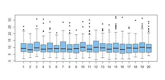
@NickCox has cautioned that most outliers are genuine data values. Samples of moderate size from many distributions (even normal) typically show outliers. As an illustration, here are boxplots
of 20 samples of size $n = 100$ from
$\mathsf{Gamma}(\text{shape} = 4, \text{rate} = 0.4) .$ sampled and plotted using R:
set.seed(2019);  m = 20; n = 100
x = rgamma(m*n, 4, .4);  g = rep(1:m, each=n)
boxplot(x~g, col="skyblue2", pch=20)
If one were systematically to remove outliers before computing
sample averages, that would underestimate the the population mean and overestimate the standard error of the population mean.
Below a is a vector of $m = 100,000$ honest sample averages
of gamma samples of size $n = 100.$ The vector b has averages that disregard boxplot 'outliers'.
set.seed(210)
m = 10^5;  a = b = numeric(m)
for(i in 1:m) {
  x = rgamma(100, 4, .4); a[i] = mean(x)
  x.out = boxplot.stats(x)$out  # list of 'outliers'
  b[i] = (sum(x)-sum(x.out))/(100-length(x.out))
  }
mean(a); mean(b)
[1] 10.00083         # aprx E(X) = 10
[1] 9.644603         # underestimate
sd(a); sd(b)
[1] 0.5012889
[1] 0.5455079
The plot below shows the kernel density estimators of the
simulated distributions of honest means (black) and
of the means of non-'outliers' (red).