2

I am looking for a good way to visualize uncertainties of an observable plotted in a 2d density plot. The plot that I have is similar to the following: enter image description here
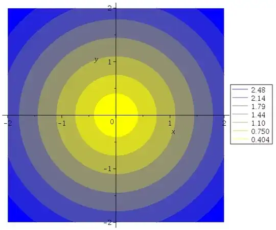
The color represents the value of the observable, so I cannot use it for uncertainties and I would prefer to avoid adding another dimension to represent the error. I thought about adding some other plots on the sides but it starts to get confusing.
254
  • 23
  • 2

1 Answers1

2

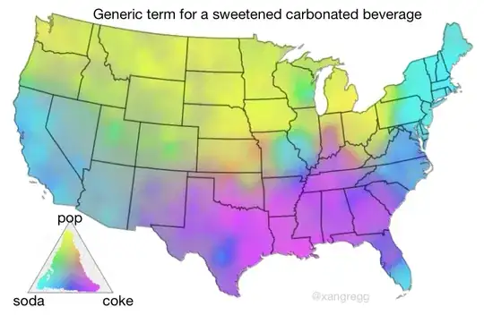
A recent idea is Value-Suppressing Uncertainty Palettes, where you use a palette of bright colors for the values but desaturate areas with uncertainty. I tried a variation of it with this remake of the soda-coke-pop dialect map. Notice the grayish areas around the Rockies where uncertainty is greatest (few samples and mixed responses).

enter image description here

And the suggestion from @user2974951 to use contour lines for the values and shading for the uncertainty seems good to me if your data is smooth enough.

Nothing wrong with secondary plots, either. Not everything has to be in one plot.

xan
  • 8,708
  • 26
  • 39
  • 1
    Thanks for the suggestion, looks like a really interesting way to show uncertainties. For the moment I opted for using secondary plots, but I will keep that in mind for the future. – 254 Sep 07 '19 at 21:08