Visual summary
There no evidence more compelling than a simple visual summary of your data:

Both figures show count vs distance, but the one on the right has a logarithmic y-axis. There is a clear trend towards lower particle counts further from the road curb, which I assume is also what you would expect. Which of these plots is better depends on your preference and your audience.
Using a statistical model
Since the sample size is limited and the figure perhaps not convincing enough to everyone, it is nice to also include some sort of measure to convince the audience that these variables do indeed correlate. You could simply calculate the Spearman rank correlation between count and distance, but this is (A) not a very strong correlation because ranks throw away a lot of information and (B) not respecting the dependency in your data (multiple pseudoreplicates of a, f and m).
Modeling counts
Instead of using ranks, or some other non-linear measure, a more efficient way to model the data is to use an appropriate conditional probability distribution (the distribution of your response (microplastics count) after accounting for the effect of the explanatory variable(s) (distance fromn the road curb).
Counts follow a discrete probability distribution. Specifically, independent counts follow a Poisson distribution. However, the Poisson distribution always has variance equal to the mean. In many cases there is an excess of variance causes by unknown contributing factors or some form of dependency. This excess of variance can be modeled by including an extra dispersion parameter, such as in the negative binomial distribution, or the quasi-Poisson distribution.
This can be done using generalized linear model, which can have any error distribution in the exponential family of distribution (including normal, Poisson, etc.).
Modeling dependency
Since your data come from the same three samples (a, f and m), it is logical to assume that measurements of these samples are more strongly correlated to each other. The plot above also clearly demonstrates this. To account for this dependency, you should include a random effect. Models with both random effects (here: sample) and fixed effects (here: distance) are called mixed models.
Without further knowledge of your experiment, I chose to model this below using a random intercept. However, you generally have to choose between a random intercept, slope, or both.
A model with an error structure in the exponential family and mixed effects is a generalized linear mixed model (GLMM). In the code below I demonstrate how you could run this analysis using either a Poisson or negative binomial error structure. I then compare the model to one that does not include a slope for distance, from which you can conclude that including distance results in a significantly improved fit.
Code
To produce the figure, run the following in $\textsf{R}$:
sample   <- rep(c("a", "f", "m"), each = 4)
distance <- rep(c(1,2,5,10), each = 3)
count    <- c(34253, 42085, 32365, 11587, 8198, 5580, 3510, 4424, 5296, 5296, 1116, 533)

plot(count ~ distance, pch = (sample), bty = "n", las = 1, cex.lab = 1.1, cex.axis = 0.8,
     xlab = "Distance from road curb (m)", ylab = "Microplastic count")
The version on the right you can obtain by including log = "y" in plot.
To fit a generalized linear mixed model in $\textsf{R}$, I recommend the package lme4:
# Using a Poisson error structure
GLMM.p  <- glmer(count ~ distance + (1 | sample), family = "poisson") # model with distance
GLMM.p0 <- glmer(count ~ 1 + (1 | sample), family = "poisson")        # null model
summary(GLMM.p)                                                       # see the coefficients
anova(GLMM.p0, GLMM.p)                                                # compare fit


# Using a negative binomial error structure
GLMM.nb  <- glmer.nb(count ~ distance + (1 | sample))
GLMM.nb0 <- glmer.nb(count ~ 1 + (1 | sample))                        # null model
summary(GLMM.nb)                                                      # see the coefficients
anova(GLMM.nb0, GLMM.nb)                                              # compare fit
The model with either error structure produces a significantly better fit if you include distance as an explanatory variable.
To get rid of the warning when fitting either model, scale the distance variable:
GLMM.p  <- glmer(count ~ scale(distance) + (1 | sample), family = "poisson")
GLMM.nb <- glmer.nb(count ~ scale(distance) + (1 | sample))
Note that the coefficients are now for the scaled distance. The remaining warning about a data argument can be ignored.
What does this model look like?
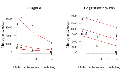
Since you only have one dependent variable, you can plot the mixed model's fit over the scatter plot at the beginning, which then looks like this:

The $\textsf{R}$ code I used for this is:
plot(count ~ distance, pch = (sample), bty = "n", las = 1, log = "y",
     xlab = "Distance from road curb (m)", ylab = "Microplastic count",
     cex.lab = 1.1, cex.axis = 0.8, main = "Original")
for(i in 1:length(unique(sample))){
    lines(
      fitted(GLMM.nb)[sample == unique(sample)[i]] ~ distance[sample == unique(sample)[i]],
      col = 2
    )
}
This figure shows the same linear relationship for each sample, albeit with a random offset (the random intercept in the GLMM). Both the Poisson and negative binomial have canonical link function log, so the figure on the right (log-scale) looks like a line (I used the negative binomial version here). Again, change the log = ... argument if you prefer the original scale.
You can use this figure, the model summary, the measure of improved fit and of course the theoretical justification for the model to convince the audience that microplastic counts diminish with distance from the road curb.

