1

I have a dataset with y-values from 0,1 and one column of x numeric values between 5000 and 40000. My expectation is that the increase in the probabilities is a lot more "bumpy" than what the logistic regression predicts.

I attempted to do a drawing in Paint below to illustrate this:

enter image description here

My question is how do I actually test what the relationship of the data is? Is there any type of numeric test to use, or is there a way to plot this properly? When I try the following code:

plt.scatter(X, y,  alpha=0.5)

plt.xlabel('x')
plt.ylabel('y')
plt.show()

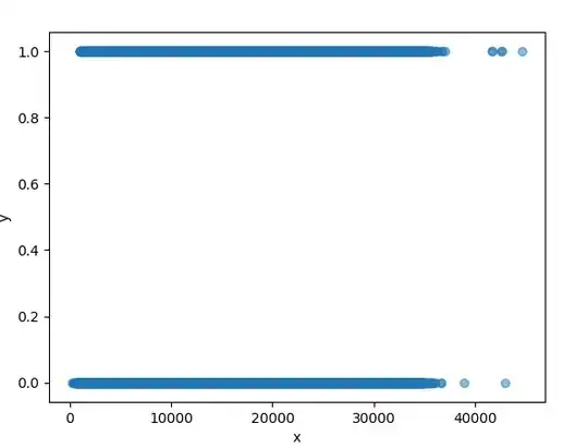
It only returns the following visual representation which doesn't really help me:

Scatterplot

Mihai Chelaru
  • 269
  • 3
  • 11
MathiasRa
  • 113
  • 4
  • Related in R https://stackoverflow.com/questions/36685921/plot-logistic-regression-curve-in-r for drawing the curve. As for testing, I have never heard of such a thing. – user2974951 Jul 08 '19 at 14:31
  • As I understand, the R plot shows the logistic regression plotted based on the predictions. However that is not what I am looking for. I am looking for a graph that can plot the data by (I guess?) grouping the observations. This will allow me to understand the actual relationship. – MathiasRa Jul 08 '19 at 14:48
  • If I understand correctly, you can draw the regular diagnostic plots from a linear model to check for discrepancies, namely Normal Q-Q plot and Scale-Location. – user2974951 Jul 08 '19 at 14:57
  • so what you should do is plot the log odds ( since logistic regression is linear in that). I have used a library in R to do this ( for your 1d data using kernel density estimates, but can't remember its name: basic idea estimate p(x|1) and p(x|0) and then estimate log(p(1|x)/p(0|x)) – seanv507 Jul 08 '19 at 15:34
  • https://cran.r-project.org/web/packages/sm/sm.pdf sm.binomial ? – seanv507 Jul 08 '19 at 15:40

2 Answers2

1

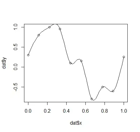
You need to provide more flexibility in modeling your continuous predictor if you suspect a nonlinear relationship between the log-odds of y-class membership and your continuous predictor.

If your subject-matter knowledge suggests a theoretical form for that nonlinear relationship, you could use that general form of the relationship to fit a logistic model.

If you don't have any information based on subject-matter knowledge, then regression splines provide a standard approach. This page shows how to use regression splines for linear regression in Python; although I don't use Python I suspect that the approach will carry over to logistic regression. Restricted cubic splines (restricted to having linear tails to prevent overfitting at the extremes) are a good choice that maintains a low degree for each of the polynomials while allowing for choices of the numbers and locations of knots to model the nonlinearity.

See this page for some discussion in the context of logistic regression. The coefficients for the spline terms would be chosen by maximum likelihood just as the single coefficient for a single-predictor logistic regression model would be. You can test the complexity of the relationship by comparing models with increasing numbers of the knots that serve as anchors in the fitting.

Once you have found a useful spline fit, you just plot the predicted log-odds of y-class membership based on the spline function against the values of the continuous predictor to get your graph.

Added in response to a comment on the original question:

Although grouping observations into bins and then plotting the observed probabilities or log-odds against the midpoints of the predictor values in the bins is one way you could proceed, the graph that you get might depend on just where you set the bin limits (as with any histogram-type approach) and it won't take advantage of the continuous nature of the predictor. If you want to know "what the relationship of the data is" then find a good continuous fit to the data.
EdM
  • 57,766
  • 7
  • 66
  • 187
0

EdM's answer makes a good point that you will likely need more flexibility in your model. Splines are indeed a good starting point.

As to your question about evaluating a probabilistic model, I recommend you look into proper . The tag wiki contains more information. These should quickly identify that a spline model is superior to one without splines.

Of course, all the standard caveats apply: don't evaluate your model in-sample, but use a holdout sample.

Stephan Kolassa
  • 95,027
  • 13
  • 197
  • 357