3

I am doing a stats assignment in python and during my preliminary data analysis I created a heatmap plot and would like to be able to explain the correlation among the variables.

However, I don't understand how the relationship works and how it can be interpreted. Any explanation on how to interpret the map would be highly appreciated.

I have attached an image of the heat map plot.
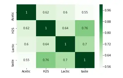
enter image description here

Ann
  • 33
  • 1
  • 1
  • 3

3 Answers3

2

Each square shows the correlation between the variables on each axis. Correlation ranges from -1 to +1. Values closer to zero means there is no linear trend between the two variables. The close to 1 the correlation is the more positively correlated they are; that is as one increases so does the other and the closer to 1 the stronger this relationship is. A correlation closer to -1 is similar, but instead of both increasing one variable will decrease as the other increases. The diagonals are all 1/dark green because those squares are correlating each variable to itself (so it's a perfect correlation). For the rest the larger the number and darker the color the higher the correlation between the two variables. The plot is also symmetrical about the diagonal since the same two variables are being paired together in those squares.

shabuki
  • 191
  • 1
  • 5
0

A heat map is an eye-catcher, nothing more. It gives extreme colors to extreme values so they are easily visible to the naked eye. Apart from that, it's just a matrix of numbers, no special interpretation required.

Petras Purlys
  • 258
  • 2
  • 10
0

A heat map is a two-dimensional representation of data in which values are represented by colors. Correlation Heat map is a two dimensional plot of the amount of correlation (measure of dependence) between variables represented by colors. The varying intensity of color represents the measure of correlation. Correlation is a measure of linear relationship between two variables. Correlation between two variables can also be determined using scatter plot between these two variables. When there are multiple variables, and we want to find the correlation between all of them, a matrix data structure called correlation matrix is used. Correlation values ranges from -1 to +1.

Using Seaborn package of Python heatmap can be plotted. To determine the correlation corr() method of pandas can be used. sns.heatmap(df.corr())

Lin
  • 1