0

In R, I have produced a boxplot for two different groups, with discrete y-values between 1 and 20. My goal from this work is to investigate whether the average count differs between A and B:

unscaled = ggplot(data3, aes(x = A_or_B, y = Count))+geom_boxplot()

untransformed

The problem with this is the significant skewness towards one side, which I believe should be solved with an appropriate transformation. The difficulty is that the mode count = 1 and decreases exponentially as count increases. I have tried and considered several transformations.

I have tried a log transformation, which I believe failed because the value the plot is weighted around is 1:

data3[33]=log(data3["Count"])
logTransformed = ggplot(data3, aes(x = A_or_B, y = logCount))+geom_boxplot()

log Transformed

I also tried 1/e as a transformation:

data3[34]=(1/exp(data3["Count"])
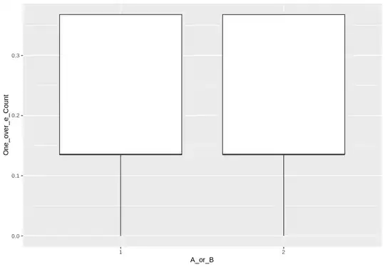
One_ovr_e_Transformed = ggplot(data3, aes(x = A_or_B, y = One_over_e_Count))+geom_boxplot()

1/e transformed

None of these look as I would expect/want them to look. I'm struggling to find other appropriate transformations that could be applied.
Nick Cox
  • 48,377
  • 8
  • 110
  • 156

1 Answers1

4

It's evident that for both groups 1 and 2:

  1. At least 25% of your data points are 1. (1 is shown on the box plots as the lower quartile and the minimum too.)

  2. At least 75% of your data points are 1 or 2. (2 is shown as the median and the upper quartile.)

From the information that 1 is the mode, a further guess is that perhaps 40-45% are 1 and another 35-40% are 2.

The "average" (mean?) is not usually shown by default on a box plot, although all good statistical software should allow plotting means as extra detail on a box plot.

On general grounds and from other answers on this tag (e.g. Help needed with my box plot) I would suggest that box plots are often ineffective in showing the detail of spiky discrete distributions. In particular, although most of the possible values up to 20 do occur in your data, the box plot is not informative about their absolute or relative frequency.

From the answer just cited alone, I suggest that simple histograms (bar charts) showing your frequencies would be much more direct and informative. (Plotting frequencies on a square root scale is a possible trick.)

Transformations can't help much here either. They just transform each distribution with several spikes into another with exactly the same number of spikes. Also, if the mode is the smallest value, then that fact will always imply asymmetry of a discrete variable, as any one-to-one transformation will still result in the mode being at one end of the distribution. Note that the over-drastic negative exponential transformation just flips the mode from the minimum observed value to the maximum transformed value.

To compare the means, just compare the means. It's possible that bootstrapping the difference in means would help.

Posting your data, or in this case the table of counts, would allow more developed answers.

Nick Cox
  • 48,377
  • 8
  • 110
  • 156
  • Sorry, I think I explained the question wrong. This is a practice question I have been given to do. The boxplot is definitely not the best way to show the data but it is a requirement. Aside from that, I know which is the mode and how they are distributed, I would like to show the distribution more clearly which I thought could be done by scaling the y-axis appropriately. – thatsnotmyname71 Nov 26 '18 at 17:43
  • 1
    I have written programs and papers with box plots as key players but it sounds as if I would fail on this question. You have got box plots. If the remaining question is how can the box plots be improved by transformation my answer is "Not at all; and it's a bad idea in the first place." I did try to be constructive.... – Nick Cox Nov 26 '18 at 18:02
  • What's more; as your examples of transformations show, whether points are beyond upper quartile + 1.5 IQR or lower quartile $-$ 1.5 IQR is dependent on which scale you work on. Some transformations even produce outliers. – Nick Cox Nov 26 '18 at 18:04
  • Nick, I apologize as I truthfully wasn't trying to cause offense or be arrogant in my reply. I am by no means an experienced statistician and can see you put time and effort into helping me here. Your points have helped my understanding in general, the limiting factor here is likely my understanding of the task. – thatsnotmyname71 Nov 27 '18 at 17:21
  • No offence inferred or taken. In turn my sense of humour may not be easy to decode and I am not any kind of statistician. I am still puzzled on whether you are tackling an assignment for some course and **must** draw a box plot. If not, then as said, open up the thread by showing up the table of counts so that I and others can show different plots. – Nick Cox Nov 27 '18 at 17:43