15

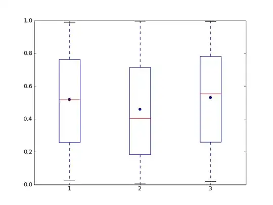
When plotting a boxplot with python matplotblib, the lines halfway the plot is the median of the distribution.

Is there a possibility to instead have the line at the average. Or to plot it next to it in a different style.

Also, because it is common for the line to be the median, will it really confuse my readers if I make it the average (off course I will add a note what the middle line is)?

csgillespie
  • 11,849
  • 9
  • 56
  • 85
Peter Smit
  • 2,030
  • 3
  • 23
  • 36

2 Answers2

26

This code makes the boxplots then places a circle marking the mean for each box. You can use a different symbol by specifying the marker argument in the call to scatter.

import numpy as np
import pylab

# 3 boxes
data = [[np.random.rand(100)] for i in range(3)]
pylab.boxplot(data)

# mark the mean    
means = [np.mean(x) for x in data]
pylab.scatter([1, 2, 3], means)

alt text

ars
  • 12,160
  • 1
  • 36
  • 54
  • 3
    See http://stackoverflow.com/questions/2492947/boxplot-in-r-showing-the-mean for solutions using R – James Oct 19 '10 at 09:40
  • 1
    @James: I am not trying to be a jerk and single you out but your comment begs a question from me. Why is it that whenever anyone on this forum explicitly asks how to do something using a non-R language (since R is _de facto_ default), someone always has to suggest using R? I don't find the converse much. SAS programmers don't generally comment on "How do I do X in R?" questions with "Here is how to do it in SAS...". I know people love R (and I do too), but... – Josh Hemann Oct 18 '11 at 17:53
20

To answer your second question: Yes, I think it will be confusing to put the line at the mean instead of the median. The precise rules controlling the length of the 'whiskers' (if any) and treatment of outliers vary, but everyone keeps to Tukey's use of the box as displaying the median and lower and upper quartiles. For highly skew distributions, the mean could be outside the box, which would look very odd. Common usage is that the median goes with the interquartile range, while the mean goes with standard deviation (or standard error of the mean if you're interested in inference rather than data description). If you want to show the mean visually, i'd use a different symbol to display it to avoid confusion.

onestop
  • 16,816
  • 2
  • 53
  • 83