A couple of years too late, but I'd really like to add my own intuitions on this topic. It's my own take, so if I'm wrong about this, please do pull me up.
As Ben says in the comments, the main difference is that the mixed model estimates the right amount of shrinkage for you. But you might want to understand this more deeply (as I did)...
The main hurdle we need to get over is to understand exactly what the mixed model is doing when it shrinks the coefficients, and why. For me the clearest intuition about random effect shrinkage is: shrinkage is an attempt to reverse the effects of adding noise.
The Effects of Adding Noise
It's often easier to understand stats if we make a sillily-exaggerated example. In that spirit, have a look at the graph below (I have added the code at the bottom of this answer, in case you want to have a play with it).
Here we have twelve groups. The true group means are in red: they are normally distributed with a standard deviation of 1. The grey dots are samples drawn from these groups; within each group, there is a lot of noise: with a standard deviation of 5. For groups 1 to 6, we have 100 samples from each group. For groups 7 to 12, only two each. The blue crosshairs are our attempts at hitting the red targets: they are the means of the samples from the groups.
Now, here's the key intuition that justifies shrinkage: noise makes things spread out. (And shrinkage is simply the reversal of this.)
We can see that particularly clearly in groups 7-12, where the crosshairs are scattered quite widely compared with the red targets. We can calculate how spread out these are using two facts from basic 101 stats:
- Firstly, we know that the variance of a sum is the sum of the variances.
- The variance of a sample mean is the variance of the individual data-points divided by the number of datapoints.
So, the variance of our crosshairs is
$\mathrm{var}(crosshairs_i) = \mathrm{var}(red\_dots) + \mathrm{var}(within\_sample)/n_i = 1^2 + 5^2/n_i$
where $n_i$ is the sample size in the group we are concerned with, group $i$. (We know that $\mathrm{var}(crosshairs)$ differs between the groups; just look at the graph!)
So, for groups 1 to 6 that means var(crosshairs) = 1.25, and for groups 7 to 12, var(crosshairs) = 13.5. In the latter case, the crosshairs are truly terrible estimates for the red dots -- they are $SD=\sqrt{13.5}=3.7$ times as spread out as they should be. BUT note that they are also not exactly perfect in groups 1 to 6 either, having $\sqrt{1.25} = 1.12$ times the spread that they should.
The Solution: Shrinkage
So, the idea of shrinkage is: let's try to bring them into the right ballpark. We'll harness all the data in all the groups to try to estimate the overall grand mean (the mean of all the red dots) and shrink all our data points towards that, according to how far they will likely have been thrown out by the noise. In the end, we hope to give them the same variance as the red dots. We can do that by dividing by the $\sqrt{\mathrm{var}(crosshairs)}$, and multiplying by $\sqrt{\mathrm{var}(red\_dots)}$, so that they will have the right variance.
(Of course, we don't know var(red_dots) or var(within_sample), but conveniently, our mixed model can estimate those for us -- and, again, it can pool all of the data together to get that as accurate as possible).
So, in the example above, if we shrink all the blue crosses towards towards the grand mean we are able to pool all the available information (both in estimating the grand mean, and in estimating the red_dots and within_sample variances) and use those to pull the crosshairs back to the zone where they should have been in the first place. Now, for groups 7 to 12, it's probably a bit late for them: those means are dominated by that noise, so the best we can do is to pull them back so that they are not pathologically far off. For means 1 to 6 though, they are dragged in, just a little bit, and that little bit, just like with the other ones, will get them that little bit closer to where they are meant to be.
The purple crosses above show the result of doing this (compared with the blue crosses that were our original estimates). We can see that by pooling the information together we've been able to use information from the larger groups to place the smaller groups in a much more sensible position. But this is important: it is not only that the small groups learn from the big ones. They all learn from each other. All of them need to be pulled in, even if just a little bit, and they use the information that is pooled between all of them to do that.
Comparison to Bayes
I should say that Bayesian stuff isn't my area. But this has been a really nice opportunity to try my first experiments in the area, and the results are really interesting. Remember that the mixed model is trying to reduce the variance of the estimated means so that they will have what it estimates to be the "right" variance. In this case, it estimates the groups to have a SD of 0.75 and the within_group SD to be 5.1. It estimates the grand mean to be 0.035.
The Bayesian method is rather similar, but you get to choose your own grand mean and SD to aim for! But, if we build our prior based on the mixed model, that is, if we set our prior to be normal with mean 0.035 and SD 0.75, look what happens:
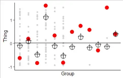
Here, the crosses are the predicted effects from lme4; the black circles are the parameter estimates from bayesglm... (The red dots are as before). Spooky eh?
Can I Just Use bayesglm Instead of lmer?
The bad news, if (as per your comments) you're looking to shortcut by using bayesglm, is that it is that step -- estimating the variances in the mixed model -- that is the computationally expensive bit. (And lme4 is already pretty smart about how it reduces that). So, you're kinda back to square one.
Code
library(ggplot2)
library(lme4)
library(arm)


group.sizes <- c(100, 100, 100, 100, 100, 100, 2, 2, 2, 2, 2, 2)
between.group.sd <- 1
within.group.sd <- 5


set.seed(1)


# simulate data
num.groups <- length(group.sizes)
u <- rnorm(num.groups, sd=between.group.sd)
sample.data <- data.frame(
  group.num = unlist(mapply(rep,   times=group.sizes, x=1:num.groups)),
  samples   = unlist(mapply(rnorm, n    =group.sizes, mean=u, sd=within.group.sd))
)

# estimate means
means <- data.frame(
  group.num   = 1:num.groups,
  true.mean   = u,
  sample.mean = with(sample.data, aggregate(samples, by=list(group.num), FUN=mean))$x
)
grand.mean <- mean(sample.data$samples)

# fit a mixed model
mixed.model <- lmer(samples~(1|group.num), data = sample.data)

# use estimate from mixed model to fit a bayesglm
mixed.model.u.sd <- sqrt(as.numeric(VarCorr(mixed.model)$group.num))
mixed.model.int  <- fixef(mixed.model)
bayes.model <- bayesglm(
  samples~factor(group.num)+0,
  data=sample.data,
  prior.mean=mixed.model.int,
  prior.scale=mixed.model.u.sd,
  prior.df=Inf,
  scaled=FALSE
)

# pull the different mean estimates from the different models
means$bayesian       <- coef(bayes.model)
means$random.effects <- ranef(mixed.model)[["group.num"]][["(Intercept)"]]
means$shrunken.mean  <- grand.mean +
  (means$sample.mean - grand.mean) / sqrt(between.group.sd^2 + within.group.sd^2 / group.sizes)

# so we can zoom the graphs in
red.dot.lims <- c(
  min(means$true.mean),
  max(means$true.mean)
)
crosshairs.lims <- c(
  min(means$sample.mean),
  max(means$sample.mean)
)


plot.with.sample.means <- ggplot(means, aes(group.num)) +
  geom_point(aes(y=samples),              size=1.5, colour="light grey", data=sample.data) +
  geom_point(aes(y=true.mean),            size=4,   colour="red"                         ) +
  geom_point(aes(y=sample.mean), shape=4, size=4,   colour="blue"                        ) +
  scale_y_continuous("Thing") +
  scale_x_discrete("Group") +
  theme_classic()

print(plot.with.sample.means)

plot.with.shrunken.means <- ggplot(means, aes(group.num)) +
  geom_point(aes(y=samples),                size=1.5, colour="light grey", data=sample.data) +
  geom_point(aes(y=true.mean),              size=4,   colour="red"                         ) +
  geom_point(aes(y=sample.mean),   shape=4, size=4,   colour="blue"                        ) +
  geom_point(aes(y=shrunken.mean), shape=4, size=4,   colour="magenta"                     ) +
  scale_y_continuous("Thing", limits = crosshairs.lims) +
  geom_hline(yintercept=grand.mean) +
  scale_x_discrete("Group") +
  theme_classic()

print(plot.with.shrunken.means)

plot.mixed.model.vs.bayes <- ggplot(means, aes(group.num)) +
  geom_point(aes(y=samples),                 size=1.5, colour="light grey", data=sample.data) +
  geom_point(aes(y=true.mean),               size=4,   colour="red") +
  geom_point(aes(y=bayesian),       shape=3, size=4,   colour="black") +
  geom_point(aes(y=random.effects), shape=1, size=5,   colour="black") +
  scale_y_continuous("Thing", limits = red.dot.lims) +
  geom_hline(yintercept=grand.mean) +
  scale_x_discrete("Group") +
  theme_classic()

print(plot.mixed.model.vs.bayes)


