I would recommend plotting each event separately, using a dotchart over the days of the year.
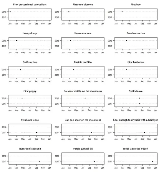
This shows you immediately that the one event we have a date for in both years ("Swifts leave") happened on the same day in both years. Once you have a few years' worth of data, you can see typical variability or trends.
You might want to restrict the horizontal axis for each plot. No need to show November and December for "First tree blossom", while "First processional caterpillars" could already happen in the previous year.
If you are interested in whether different events flip orders, you could show multiple events in the same plot, using different colors for the different events. Just don't overdo it - if you try showing all 18 events using18 colors, you will run out of colors and end up with something incomprehensible. Instead, group maybe 3-5 events that are related. If you do so, I would stagger them vertically slightly above and below the "year" lines.
R code below:
dates <- data.frame("2017"=c(rep(NA,11),"2017-08-01","2017-09-01","2017-09-16","2017-09-18","2017-10-01","2017-10-17","2017-12-01"),
    "2018"=c("2018-01-01","2018-02-23","2018-02-25","2018-02-27","2018-03-10","2018-04-05","2018-04-06","2018-04-08","2018-04-08","2018-04-21","2018-07-22","2018-08-01",rep(NA,6)),
    stringsAsFactors=FALSE)
rownames(dates) <- c("First processional caterpillars", "First tree blossom",
"First bee", "Heavy dump", "House martens", "Swallows arrive",
"Swifts arrive", "First tic on Cilla", "First barbecue", "First poppy",
"No snow visible on the mountains", "Swifts leave", "Swallows leave",
"Can see snow on the mountains", "Cool enough to dry hair with a hairdyer ",
"Mushrooms abound", "Purple jumper on", "River Gavressa frozen")

Sys.setlocale(locale="US")
opar <- par(mfrow=c(6,3),mai=c(.5,.5,.5,.1))
    for ( ii in 1:nrow(dates) ) {
        plot(as.Date(c("2017-01-01","2017-12-31")),c(0.5,ncol(dates)+0.5),type="n",yaxt="n",main=rownames(dates)[ii],xlab="",ylab="")
        axis(2,1:nrow(dates),2016+(1:nrow(dates)),las=1)
        abline(h=1:nrow(dates),lty=2,col="lightgray")
        index <- which(!is.na(dates[ii,]))
        points(as.Date(paste0("2017",substr(dates[ii,index],5,10))),index,pch=19)
    }
par(opar)
