1

Real world example - we have a data set with emails sent, and time in seconds from sent date to when a click happened. I want to be able to produce a metric such as:

Most of the clicks happened in X seconds, plus or minus some number.

Is the best way to do that to use an inverse distribution function with a 50 percentile?

ID SECONDS Percentile_Cont 
-- ------- --------------- 
1  110000      2750 
2    3100      2750 
3    2900      2750
4    2800      2750
5    2700      2750
6    2600      2750
7    2500      2750
8       1      2750
9       1      2750

For example, using SQL's percentile_cont function, we get 2750. Here is a SQL Server Example showing that result for those 9 values:

SELECT 
    PERCENTILE_CONT(0.5) WITHIN GROUP (ORDER BY A desc) OVER (PARTITION BY b) D
FROM
(
    SELECT 1 B, 110000 A UNION 
    SELECT 1 B,   3100 A UNION 
    SELECT 1 B,   2900 A UNION 
    SELECT 1 B,   2800 A UNION 
    SELECT 1 B,   2700 A UNION
    SELECT 1 B,   2600 A UNION 
    SELECT 1 B,   2500 A UNION 
    SELECT 1 B,      1 A UNION
    SELECT 1 B,      1 A  
) A

This seems to do what I want, but Are there better ways? Does that actually answer the question in the way I intended?
Ferdi
  • 4,882
  • 7
  • 42
  • 62
GWR
  • 121
  • 3
  • P.S. First time on this site, and I am a bit green with analytical statistics stuff. Please let me know if I need more info or if I am not talking about something in the right way. – GWR Jun 14 '18 at 17:34
  • 1
    Using percentiles may be a reasonable approach, but do you think that the 50th percentile translates to "most"? – Sal Mangiafico Jun 14 '18 at 17:47
  • You are right, I am just realizing the flaw in this approach. – GWR Jun 14 '18 at 17:50
  • If you are using percentiles, maybe the first question is, do you want to capture the center of the distribution, or one end? That is, "50% were less than 2750" or "The middle 50% were between 1 and 2900". – Sal Mangiafico Jun 14 '18 at 17:54
  • I am not sure I want either, but I am not sure of the right terminology to explain it. In the example, ~66% of the rows 2500 and 3100 and the rest are clearly outliers. but it could just as easily be that the 1st 6 rows are a value like 1100000 and the rest of the rows are outliers from that... So lets refine to, say, "70% of the emails were clicked within x to y seconds" – GWR Jun 14 '18 at 18:00
  • You can do that. The range is then the 15th percentile and the 85th percentile, and 70% of values fall within that range. – Sal Mangiafico Jun 14 '18 at 18:09
  • I may be misunderstanding and/or out of my depth here... but what if the 70% of interest are located from 0% to 70%, and 71% to 100% are the outliers – GWR Jun 14 '18 at 18:37
  • 2
    It's unreasonable (and unproductive) to declare a large minority of your data to be "outlying." Your problem is that you haven't articulated in any quantitative way what you mean by "most"--and we can't really guess that for you. Just pick some meaningful value for $X$ and compute what "most" means, or pick some meaningful value for "most" and work out what $X$ would be. – whuber Jun 14 '18 at 18:55
  • @GWR , In that case, you would need to come up with a definition of what you mean by "outlier". – Sal Mangiafico Jun 14 '18 at 19:37
  • 1
    See also https://stats.stackexchange.com/questions/76848/retrieving-minimum-width-that-contains-specified-fraction-of-all-values for the idea of the shortest half, i.e. the shortest interval which includes half the observations. There is nothing magic about one half as a fraction, but choosing another fraction might entail some programming in your favourite statistical environment. – Nick Cox Jun 15 '18 at 08:00

2 Answers2

1

Yes, percentiles are likely a good choice here.

When you look at the analysis of service times it's fairly common to see the percentiles for 50%, 90%, 95%, 99%, 99.9%, 99.99%, ...

The exact percentiles worth reporting depends on your data. If the values are too small, it may be worth skipping smaller percentiles (no one is interested if the fastest 10% and the fastest 50% have the same value). And once you run out of data, stop reporting the high quantiles.

The idea is to report e.g. 50% of queries are answered in less than 1ms, 90% in less than 2ms, 99% in less than 3 ms, but there is 0.1% of problematic queries that take 1 second or longer, causing trouble. For that 0.1% you need to make the system faster (or not - 0.1% may not be worth that extra effort).

Has QUIT--Anony-Mousse
  • 39,639
  • 7
  • 61
  • 96
1

Most of blah-blah happens within a certain range, how can we describe it? Like @Anony-Mousse already stated percentiles are a good way to measure it.


A particular case which is often applied in practice is the IQR (Interquartile-Range). It means that 50 % percent of the data lies within a certain range. Therefore it is all the data between the 25th percentile and the 75th percentile. As the 25th percentile is the 1st Quartile and the 75th percentile is the 3rd Quartile it is all the data between the 1st and the 3rd Quartile.

iris_new <- iris[!colnames(iris) %in% c("Species")]

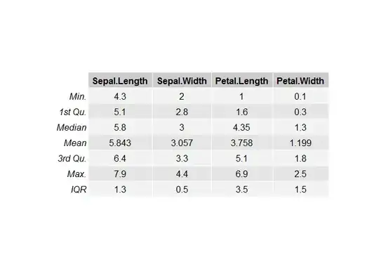
my_summary <- rbind.data.frame(sapply(iris_new, summary), sapply(iris_new, IQR))

rownames(my_summary)[7] <- "IQR" grid.table(my_summary)

enter image description here

As you can see the IQR for Sepal.Length is 1.3 (6.4-5.1). The IQR for Sepal.Width is 0.5 (3.3-2.8).

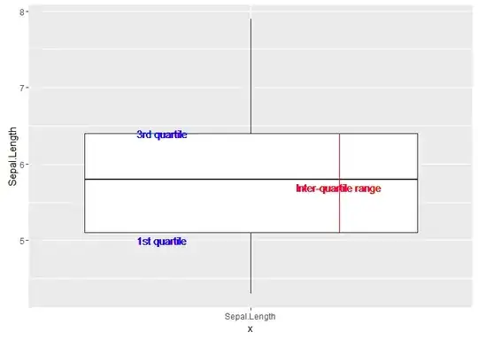
The IQR is the "space in the box" in a boxplot.

library(ggplot2)

ggplot(iris, aes(x = "Sepal.Length", Sepal.Length)) +

  geom_boxplot() +

  geom_text(aes(x = 0.8, label = "1st quartile", y = 5,1), colour >= "blue") +

  geom_text(aes(x = 0.8, label = "3rd quartile", y =  6.4), colour >= "blue") +

  geom_segment(aes(x = 1.2,  y = 5.1, xend = 1.2,yend = 6.4), colour >= "red") +

  geom_text(aes(x = 1.2, y = 5.7, label = "Inter-quartile range"), colour >= "red")

enter image description here


An alternative would be to apply an outlier test, e.g. Bonferroni test.

Ferdi
  • 4,882
  • 7
  • 42
  • 62