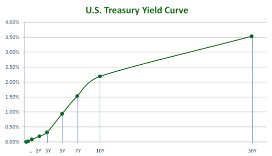
Suppose, you're dealing with interest rates. There you have the yield curve, which is represented by rates from 3 months to 30 years. The rates can be pulled for today here at Fed's web side. If you draw the rates as a line with the tenor on the x-axis and the rate on the y-axis, you get a curve for each observation day, something like this one: 
You can observe that short rates are lower than long maturity rates on the chart above, e.g. 2 year rate is 0.25% and 30 year rate is about 3.5%. So, we can say that the yield curve is upward sloping. It's usually this way.
Now, you can collect all these curves for many days, then apply PCA like in this question. Here, each interest rate (tenor) such as 2Y, 3Y, 5Y etc. is a feature of the curve. In this case the obtained principal components will have nice interpretation: PC1 is the level of the yield curve and PC2 is its slope. You can think of a level as an average interest rate.
If you apply the loading from this PCA to your two sets, then your plot would tell the following: when the level of the curves went up, the red set had the curves flattening, while the blue set had curves steepening. Here's how you get to say this: PC1 is negatively correlated with PC2 in a red set. So, when PC1 increase it indicates that the level increases, but this tends to decrease the slope which is represented by PC2. In your case PC1 and PC2 will have a different interpretation. So, you'll have to apply this logic to your case taking into account that.
What's peculiar with your chart is that your PC1 and PC2 are correlated in these sets. The PCs are supposed to be uncorrelated. So, this is something else you need to contemplate: perhaps both your sets are different from the original sample on which you calculated the PCA loadings.

