1

Suppose I have some sample data $x_i$ then I can estimate the quantile $Q_p(x_i)$ using for example the quantile() function in R.

Now suppose I add some random noise to the data: $y_i=x_i+\epsilon_i$ (keeping the $x_i$ unchanged) where $\epsilon_i$ are i.i.d. and drawn from some distribution with zero mean.

Is there anything I can say about the distribution of $Q_p(y_i)$?

I've done some numerical experiments in R in which the $x_i$ are constructed at the outset from a normal distribution and then the $\epsilon_i$ are randomly drawn from a known distribution (either uniform or normal). $Q_p(y_i)$ is calculated 500 times with different random $\epsilon_i$ to estimate its distribution.

It looks like $Q_p(y_i)$ follows a bell shaped curve with a larger mean than $Q_p(x_i)$. Is there any theory on this?

R code below:

x <- rnorm(1e6,0,1/qnorm(0.95))

Q_simulated <- rep(NA,500)
for(s in 1:500)
{
  epsilon <- rnorm(length(x),0,0.05)
  y <- x+epsilon
  Q_simulated[s] <- quantile(y,0.95)
}

ggplot(data.frame(x=Q_simulated),aes(x)) + geom_histogram() + geom_vline(xintercept=quantile(x,0.95),colour="red") 

enter image description here

EDIT:

Drawing a scatter plot of $x$ versus $y=x+\epsilon$ in red, superimposing the unit line in black and various quantiles $(Q_p(x),Q_p(y))$ in blue gives the following plot:

x <- rnorm(1e5, 0, 1/qnorm(0.95))
epsilon <- rnorm(length(x), 0, 0.2)
y <- x + epsilon

p <- seq(0.1, 0.9, 0.1)
p <- c(0.01*p, 0.1*p, p, 0.9+0.1*p, 0.99+0.01*p) 
qx <- quantile(x,p)
qy <- quantile(y,p)

ggplot(data.frame(x=x, y=x+epsilon), aes(x, y)) + geom_point(colour="red", alpha=0.04) + geom_abline(slope=1, intercept=0) + geom_point(data=data.frame(x=qx, y=qy), colour="blue")
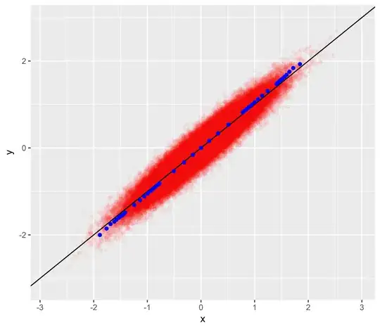
enter image description here

  • 1
    Yes, there's theory. You might start with https://stats.stackexchange.com/questions/45124 (which addresses all quantiles even though the question is explicitly about medians). – whuber Feb 27 '18 at 23:26
  • 1
    Thanks. So the distribution of the quantile is normal with mean=$Q$ and variance = $p(1-p)/(n\cdot f_X(Q)^2)$ where $Q=Q_p(x_i)$. But in all my simulations the bell curve seems to have a significantly higher mean than $Q$ - is this due to `quantile()`'s definition (Hyndman & Fan Type 7)? – Bob Mortimer Feb 27 '18 at 23:48
  • 1
    I see only *one* simulation. What happens when you repeat for new independent values of `x`? (You don't need a sample of a million: a sample of a few thousand should do just fine.) – whuber Feb 27 '18 at 23:55
  • 1
    Thanks, if `x` can vary then `y` is a normal with slightly increased variance and the red line=$Q$ is spot on in the centre. However in my question `x` is fixed in advance and I am adding noise to it, in effect $y_i$ are random variables which are not i.i.d – Bob Mortimer Feb 28 '18 at 00:05
  • Since `x` is fixed in advance, it's useless to compare the mean of the quantiles in your code to $1$: you need to compare that mean to the 95th percentile of `x` itself. – whuber Feb 28 '18 at 14:54
  • Agreed and the red line is drawn on the 95th percentile not $1$: `geom_vline(xintercept=quantile(x,0.95)` . I'm just trying to get to the bottom of why the random noise - which has pluses and minuses - seems to increase the quantile estimate. It wasn't clear from a previous comment but I see this consistently when re-running the script (so different x) or changing parameters in the script such as the s.d. of $\epsilon$ – Bob Mortimer Feb 28 '18 at 22:25
  • Okay, I understand now (+1). This is the regression effect! – whuber Feb 28 '18 at 22:52
  • Intuitively, imagine drawing the $x$ on an axis and putting a red mark at the 95th percentile. Add the random noise: the quantile result can change if i) a low $x_i$ element gets a high $\epsilon$ and crosses the mark left to right or ii) a high $x_i$ value gets a large negative $\epsilon$ and crosses right to left. I expect the $x_i$ to the right of the red mark (larger) are more spread out and further from the red mark, so it is harder for them to cross. Hence why the random noise seems to increase the quantile. But I don't know whether this is correct. – Bob Mortimer Feb 28 '18 at 23:05
  • Look at it like this: draw a scatterplot of $(x,x+e)$ where $e$ is the random noise. Compare extreme quantiles of the two coordinates. For reference, draw the diagonal line of unit slope. It will be clearer if you make the variance of the noise larger than in your example. – whuber Feb 28 '18 at 23:17
  • I've added and edit to the question with these but I can't see how this explains the regression effect, in particular it's not clear to me how you can see the effect on the quantiles of y from the plot – Bob Mortimer Mar 01 '18 at 00:08

0 Answers0