I'm looking for way to visualize subjective rankings, separate from my non-parametric tests.
I've asked 12 participants to rank 8 different items according to different subjective criterion (separate rankings for each one). For any individual set of rankings, I'm looking for a good way to visualized the high-level trends of the rankings.
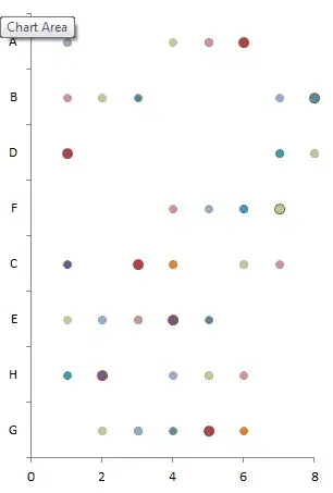
I've tried both bar and radar plots on the average rankings, and I've seen one other person use a scatter/balloon plot over the number of responses per ranking, but I'm not quite sure what conveys the best overview. Either I can use the 8 mean rankings, or the the 8 counts of each ranking per item.
Edit:
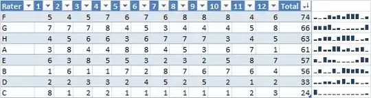
For example: Each column is an item, each row is a person's ranking of each of the eight items. Not a particularly strong agreement in this example, but in general would like to understand the best way to convey the overall trends.
                        Item:
            A   B   C   D   E   F   G   H
Rater:
  1         6   8   1   7   3   4   2   5
  2         1   3   8   7   6   5   2   4
  3         5   8   7   6   1   4   2   3
  4         5   8   7   6   4   2   1   3
  5         1   2   8   7   4   3   5   6
  6         1   7   8   5   6   2   4   3
  7         5   1   8   4   7   3   6   2
  8         4   2   8   7   6   1   5   2
  9         6   3   8   4   7   1   5   2
  10        3   2   8   7   4   1   5   6
  11        2   3   7   8   1   5   4   5
  12        8   5   6   7   2   3   1   4