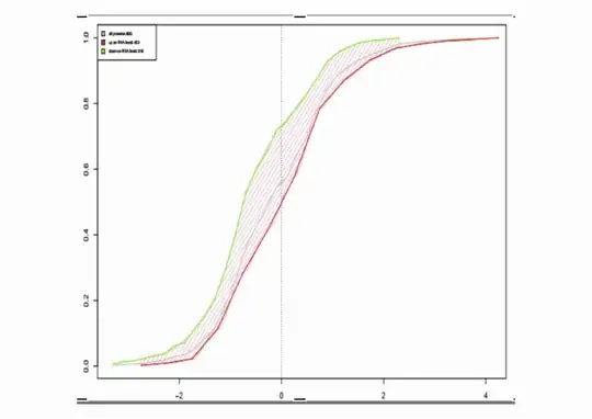
I'm looking for the best way to analyze and visualize a simple dataset. One way is by contrasting CDFs, as in the figure below: Imagine that you have children of different age, and their height. Currently, children older than 10 years are placed into one group (green), and their height is plotted by the CDF; the other children (younger than 10 years) are placed into the other group (red). The shift confirms that older children are taller. Nevertheless, the data may be misleading: There may e.g. exist a weird, opposing trend within the teenagers, among which the rule could be "the younger the taller", but the CDF-based comparison won't care. Can one do better than comparing the CDFs of the youngsters and the teenagers, considering more details, and, at the same time, use a method that is easily explained? And that is better than just some correlation coefficient?
This question is actually a followup on a previous question here. I got some better understanding of my problem based on the excellent feedback I got there, and I got some good suggestions for what may be done (e.g. the 2D earth mover's distance, but how to explain this in easy terms?), but I'm posting this followup-question in the hope that there's something still better.
