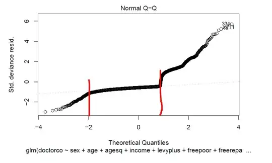
The line does not correspond to zeros. The Poisson distribution is for counts, which cannot go below $0$. You can see that there are points below the line. Instead, it is drawn through the middle of the distribution to give you a visual point (er, line) of reference. There are various algorithms for drawing the line, a common one is to draw a line connecting the first and third quartiles. I can't tell if that's what was done in your case.
At any rate, the qq-plot is constructed to help you assess if the residuals are normally distributed. But for a Poisson regression that doesn't make a lot of sense. So, I would probably ignore that plot.
Plotting to understand your model, and to check your assumptions is a very good thing to do, though. You can find some good ideas here: Diagnostic plots for count regression.
