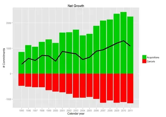
A non-profit has donors with monthly commitments, which you can think of as subscriptions. What is the best way to show for each month new acquisitions, cancels, and net growth? The relationship is
net growth = new acquisitions - cancels
The same time of chart could be appropriate for net profit (business) or net income (personal finances).
The first (and more important) problem is the design: it must be attractive and easily understood by non-technical people. The design is really the answer to this question.
The second problem, which is not required in the answer, is the implementation: I prefer to implement this in SAS, Excel, SharePoint, or some JavaScript library--- or maybe R.
One story behind the chart is new acquisitions have a high cancel rate, so they both help and hurt net growth. (However, the cancels do not distinguish whether the commitment was new or old.)
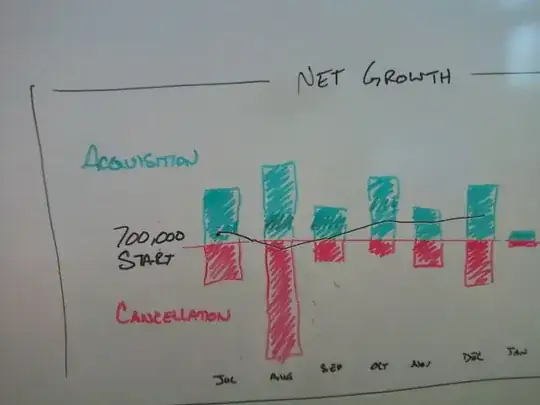
My boss drew this example chart:
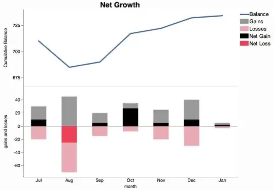
Here is a new design with an idea from xan's post. In this design, cancels are implicit, so I was able to simplify by eliminating one chart element.
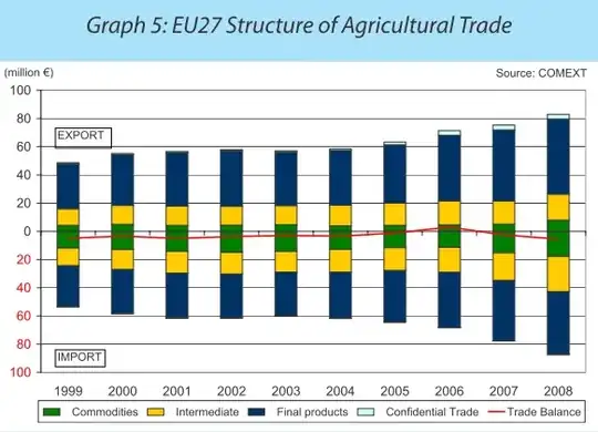
This chart from an EU report is similar: it shows imports, exports, and the trade balance.
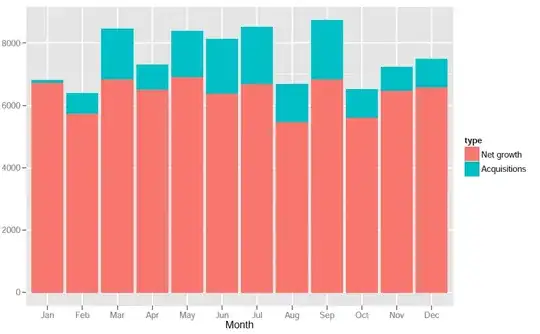
Here is what may be my final version: