When there is no bias in a group of size $k$, each position $1,2,\ldots, k$ has equal chances of winning. The expected position is $\mu(k) =(k+1)/2$ and its variance is $V(k) = (k^2-1)/12$.
When, in addition, the results are independent among the sections, each with sizes $k_i$ ($i=1,2,\ldots, n=23$), the expected sum of the winning positions $X_i$ is $\sum_{i=1}^n \mu(k_i)$ and the variance of the winning positions is $\sum_{i=1}^n V(k_i)$. With this many sections, the distribution of the sum of winning positions $\sum_{i=1}^n X_i$ will be (to an excellent approximation) approximately Normal. This provides a simple test based on
$$Z = \frac{\sum_{i=1}^n (X_i - \mu(k_i))}{\sqrt{\sum_{i=1}^n V(k_i)}},$$
which may be referred to the standard Normal distribution.
In the example, the numerator is $-13$ and the denominator is the square root of $241/3$, whence $Z=-1.45$. The test should be two-tailed (because the alternative hypothesis before examining the data would be that the winners are biased in some direction), yielding a p-value of $15\%$, which is not very small: there is only a hint of bias in these data.
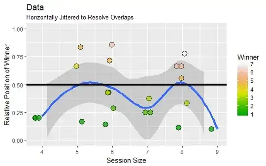
This plot of the data shows winning positions (scaled from $1/(k_i+1)$ to $k_i/(k_i+1)$) against the session sizes $k_i$. (Colors indicate raw winning positions.) The blue curve is a Loess smooth. (It hasn't been weighted by $1/k_i$, as it should be, but for crude exploration that's good enough.) The horizontal black line is the expected winning position when no bias exists.
The figure, as well as the negative value of $Z$, both suggest a slight tendency to favor earlier positions--but the test demonstrates that this is just what one would expect of random variation. It's not significant.
Edit: Checking
I checked this result (and thereby detected an error in the original reply, which quoted an incorrect formula for the variance) using the R software at https://stats.stackexchange.com/a/116913 to compute the exact null distribution of the sum of winning positions. Here is a plot of it (as black dots) on which have been superimposed (a) the Normal approximation used above (in gray), which obviously is excellent, and (b) the sum of the winning positions, shown as a vertical red line. Clearly it's a little removed from the middle of this distribution, but not much: there's a sizable chance of observing values much less than $72$ or greater than $98$ (which is the comparable region in the right tail).

Here is the additional code needed to produce these figures.
#
# Test the data.
#
winners_pos = c(2,6,1,1,6,5,1,1,3,1,3,4,5,3,2,3,1,1,2,5,6,7,3)
total_in_group = c(7,6,6,8,8,5,4,4,6,5,7,5,6,6,6,6,4,9,7,8,8,8,8)
mu <- function(k) (k+1)/2
v <- function(k) (k^2-1)/12
Z <- (sum(winners_pos) - sum(mu(total_in_group))) / sqrt(sum(v(total_in_group)))
p <- 2 * pnorm(Z)
#
# Figure 1: The data.
#
library(ggplot2)
X <- data.frame(Count=c(winners_pos, total_in_group),
       Status=rep(c("Winner", "Size"), each=length(winners_pos)))
X <- data.frame(Count=total_in_group, Winner=winners_pos)
g <- ggplot(X, aes(x=Count, y=Winner/(Count+1))) + ylim(0, 1)
g <- g + geom_smooth(size=1.5)
g <- g + geom_hline(yintercept=1/2, size=1.5)
g <- g + ylab("Relative Position of Winner") + xlab("Session Size")
g <- g + scale_fill_gradientn(colors=terrain.colors(10))
g <- g + ggtitle("Data", "Horizontally Jittered to Resolve Overlaps")
g + geom_jitter(aes(fill=Winner),
                position = position_jitter(width = 0.2, height = 0),
                size=4, pch=21, alpha=0.75)
#
# Figure 2: The exact null distribution.
#
dice <- lapply(total_in_group, die.uniform)
d <- dice[[1]]
for (i in 2:length(dice)) d <- d + dice[[i]]
# -- A plotting function
plot.die <- function(x, tol=0.001, ...) {
  i <- which.max(cumsum(x$prob) >= tol)
  n <- length(x$prob)
  i.bar <- n+1 - which.max(cumsum(rev(x$prob)) >= tol)
  plot(x$value[i:i.bar], x$prob[i:i.bar], ...)
}
plot(d, pch=19,
     xlab="Sum of Winning Positions", ylab="Chance",
     main="Null Distribution",
     sub=paste("p =", signif(p, 3)))
abline(v = sum(winners_pos), col="Red", lwd=2)
curve(dnorm(x, sum(mu(total_in_group)), sqrt(sum(v(total_in_group)))),
      add=TRUE, col="#00000040", lwd=2)


