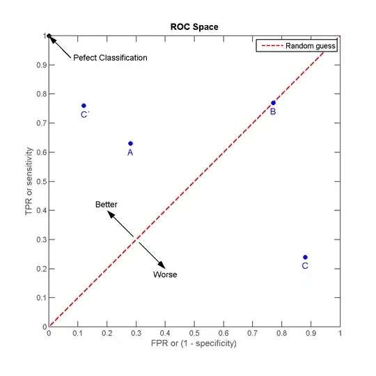
I am trying to create a graph representing a trend in binary value distribution. I thought of my own solution but it somehow doesn't feel right. Here's what I'm trying to convey with my graph:
I have a list of items that are either correct or incorrect, and their order is random. I am comparing a couple of scoring algorithms, where higher score means more certainty that the item is correct. So when the list of items is sorted by score, items at the high-score end of the list should have higher correct frequency.
My graph: It would be a 2-axis graph, where x-axis would be increasing score values and y-axis would be correct/incorrect values. The graph itself would be a series of points and their trend line. How steeply the trend line rises would indicate how good is the algorithm at guessing correct items.
The graph feels a bit weird to me, especially the 2 value y-axis, but I can't think of anything better. Is the graph okay or is there a better way to represent the data?
