I worked on this some the other day when you posted your same question to stack overflow. What I will provide won't be a finished solution, but hopefully it will give you enough ideas to finish the presentation on your own.
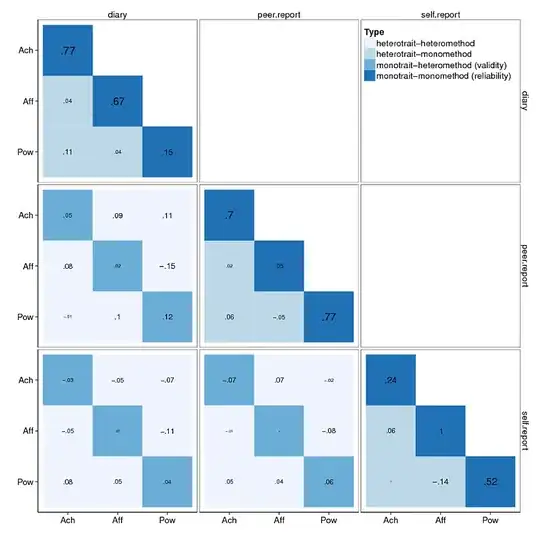
This is what I could produce in SPSS, I have posted some code here using the same logic in R with ggplot2, but I'm not as familiar with ggplot2 as I am with SPSS so it is a bit off from producing something as close to floor ready as I can with SPSS.
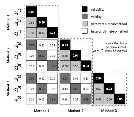
As I said in the comment to your SO post, in a grammar of graphics style you can refer to the methods as panels (facets or small-multiples are other synonyms) and the traits as defining location along the X and Y axis. Even though they are nominal categories (so there order is arbitrary) we can still treat them the say way we do continuous variables in a scatterplot. That is, we can assign observations X and Y locations in a cartesian coordinate system defined by the categories.
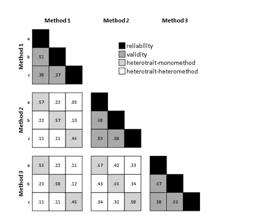
So the shape your data needs to be in (in either SPSS or R) to produce this graphic is as follows (this is a read data statement for SPSS, but this should be readily transferable to a variety of languages).
data list free / Method_X Method_Y Traits_X Traits_Y (4A1) Corr (F3.2).
begin data
1 1 a a .89
1 1 a b .51
1 1 b b .89
1 1 a c .38
1 1 b c .37
1 1 c c .76
1 2 a a .57
1 2 b a .22
1 2 c a .09
1 2 a b .22
1 2 b b .57
1 2 c b .10
1 2 a c .11
1 2 b c .11
1 2 c c .46
2 2 a a .93
2 2 a b .68
2 2 b b .94
2 2 a c .59
2 2 b c .58
2 2 c c .84
1 3 a a .56
1 3 b a .22
1 3 c a .11
1 3 a b .23
1 3 b b .58
1 3 c b .12
1 3 a c .11
1 3 b c .11
1 3 c c .45
2 3 a a .67
2 3 b a .42
2 3 c a .33
2 3 a b .43
2 3 b b .66
2 3 c b .34
2 3 a c .34
2 3 b c .32
2 3 c c .58
3 3 a a .94
3 3 a b .67
3 3 b b .92
3 3 a c .58
3 3 b c .60
3 3 c c .85
end data.
Now, for my graph I want to define one more variable (the variable used to color the blocks) and add some meta-data which propagates to the graph in SPSS.
value labels Method_X Method_Y
1 'Method 1'
2 'Method 2'
3 'Method 3'.

compute type = 0.
if method_x = method_y and traits_x = traits_y type = 1.
if method_x = method_y and traits_x <> traits_y type = 2.
if method_x <> method_y and traits_x = traits_y type = 3.
if method_x <> method_y and traits_x <> traits_y type = 4.

value labels type
1 'reliability'
2 'validity'
3 'heterotrait-monomethod'
4 'heterotrait-heteromethod'.
Now the fun part, generating the graph. SPSS's graphics language, GPL, is not as intuitive as what Hadley has written for ggplot2, but I can help break it down some. Basically everything is superfluous for our discussion here except the GUIDE statements and below (so just focus on those for now).
GGRAPH
  /GRAPHDATASET NAME="graphdataset" VARIABLES=Traits_Y Traits_X Method_Y Method_X corr type
    MISSING=LISTWISE REPORTMISSING=NO
  /GRAPHSPEC SOURCE=INLINE.
BEGIN GPL
  SOURCE: s=userSource(id("graphdataset"))
  DATA: Traits_X=col(source(s), name("Traits_X"), unit.category())
  DATA: Traits_Y=col(source(s), name("Traits_Y"), unit.category())
  DATA: Method_Y=col(source(s), name("Method_Y"), unit.category())
  DATA: Method_X=col(source(s), name("Method_X"), unit.category())
  DATA: type=col(source(s), name("type"), unit.category())
  DATA: corr=col(source(s), name("corr"))
  GUIDE: axis(dim(1), null())
  GUIDE: axis(dim(2))
  GUIDE: axis(dim(3), opposite())
  GUIDE: axis(dim(4))
  SCALE: cat(dim(2), reverse())
  SCALE: cat(aesthetic(aesthetic.color.interior), map(("1", color.black), ("2", color.darkgrey), ("3", color.lightgrey), ("4",color.white)))
  ELEMENT: polygon(position(Traits_X*Traits_Y*Method_X*Method_Y), color.interior(type), label(corr))
END GPL.
The element statement in essence specifies where things go in the plot (and what gets assigned what colors and labels. In this example the variable Traits_X gets mapped to the x axis (dim(1)), Traits_Y goes to the y axis dim(2), Method_X gets mapped to the panels going horizontally dim(3), and Method_Y gets mapped to the panels running vertically dim(4). Everything else just has to do with aesthetics in the plot (what gets what color and what label goes where).
Not all chart elements are directly exposed in SPSS syntax (you often have to hack the chart template to have certain aspects produced in a particular manner), but post-hoc editing gets you along ways in this instance. The extent I am able to reproduce the above chart (without going to great extremes) is inserted at the beginning of the question.
Two things I cannot do in SPSS (without doing hacky things with inserting text boxes on my own) are superscripts/subscripts and having label text in different colors (the labels are there, just black). These are things I would just print the graph to PDF and edit some more in Inkscape or Illustrator. I know you can do subscripts and superscripts in R labels, but one thing to note is this would break the grammar I have previously provided, as the categorical Y axis change between panels.
I could do the dashed boxes fairly easily in SPSS's editor (as well as the other text), but the arrow I could not. I know you wanted a solution in R, and I'm sure most of this logic can be ported to R code (using whatever packages you want).
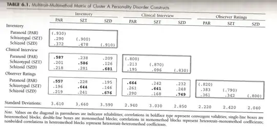
A note, in some of the comments it appears Tyler and me were confused about what MTMM is (at least I was). This page by David Kenny goes into more detail on what the method is and how to estimate such models.