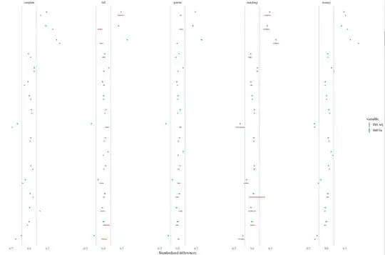
My intuition is that since you're using a single propensity score to balance across all imputed data sets, the propensity score isn't responding to the unique characteristics of each data set. That is, if you had used the "within" approach, you wouldn't expect to see such variability because each propensity score within each imputation is responding to the characteristics of its data set. The "across" propensity score might yield totally different matches of varying quality across imputations.
The unadjusted differences don't have this problem to the same degree because no matches are being formed, so the only variability in the differences is coming from the variability in the imputed values.
If you haven't, check out King & Nielson's (2016) paper on why you shouldn't use PS matching (excluding genetic and full). It may explain the poor performance of the PS in your rightmost columns.
Also, based on the names, it looks like you're using cobalt, and if so, thank you very much! I have an update coming out for it soon that will make generating love plots with multiply imputed data quite easy and straightforward. I love the idea of using the bars to represent the variability across imputations.
