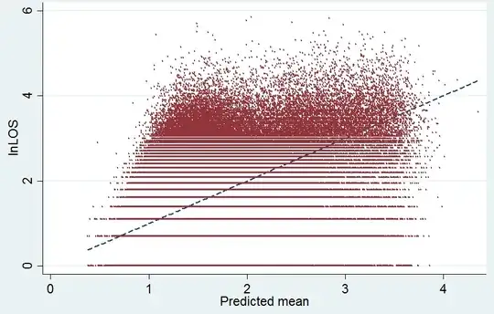
Your variable is measured in days, so the lowest value is $1$ day or $\ ln 1=0$, the second lowest value is $2$ days or $\ln 2\approx0.69$, the third is $3$ days or $\ln 3\approx1.10$, etc. That is what you see in the graph; the bottom three horizontal lines of points happen at about the values $0$, $0.69$, and $1.10$. So the graph accurately represents what is happening in your data.
You mentioned you wanted to treat length of stay as continuous. However, what would that mean in terms of your length of stay variable? In principle we could have measured length of stay in hours. This would not solve the problem completely, as the variable will still be granular to some extent, but the graph would look much prettier. More importantly, does that extra detail contain information you care about? Probably not, as the hour of the day that you leave a hospital is largely determined by organizational concerns, e.g. when is the doctor who does the final check-up available? So a finer measure of length of stay would probably only add random noise to your variable.
Having said all that, I probably would not use a linear model for such duration data. There is a whole set of statistical models that are explicitly designed for such data, typically referred to as survival analysis. See here, here, here, or here.
