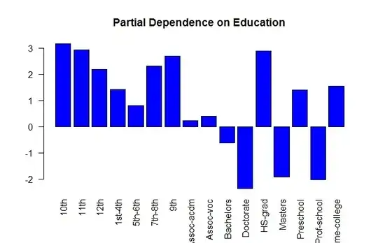
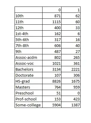
Partial plots don't have to indicate in the same direction of the data univariately, in fact, this is what makes them useful.
Partial plots are showing you the marginal effect of just this variable. It is likely that there are predictors in your dataset heavily correlated with Education=10th and Education=Doctorate that already account for the univariate effect. Once that effect is controlled for, Education=Doctorate really does reduce your propensity to be whatever your IV is.
Here's a contrived example. Imagine we're trying to predict drinks_coffee, and have data like this:
education  likes_coffee  drinks_coffee
     10th             1              1
     10th             0              0
     10th             0              0
     10th             0              0
Doctorate             1              1
Doctorate             1              1
Doctorate             1              0 *
Doctorate             0              0
Univariately, education=Doctorate seems to imply greater propensity to drink coffee. However, if we include likes_coffee in a model, the effect of having education=Doctorate actually decreases your propensity to drink coffee. likes_coffee soaks up the overwhelming majority of the signal, but it's only possible to like coffee and not drink it you have a Doctorate (starred row).
Does education come high in relative influence? Are there other big predictors that could be explaining the massive univariate difference? Of course, it's always possible your model has a bug in it.

