6

I've been gathering data at work to determine the losses in some cables that connect rooms, and now I need to take that data (~1500 points) and, because of software limitations, reduce it to 72 points that still keep the shape of the curve.

I've been working in excel and have tried looking this up, but the issue is that I can't just take "every nth row" and be done with it, since that would distort the curve's shape.
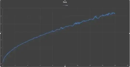
One of the curves I need to reduce to 72 points

A chart with the points of data I gathered by hand before looking for a better method EDIT: I tried to not make the question over complicated by explaining exactly how this is being used and that was my mistake, since it makes my question quite ambiguous. This data is the insertion losses for some distance of cables on both the inside and outside of a chamber (There is a high frequency connector that connects them in the middle). We use software in order to operate test equipment, and, at least for tests that the software goes from frequency to frequency, the software takes account of these losses by looking them up from a database for a specific cable (or group of cables) and uses linear interpolation between specified points to better estimate them. The issue is that this software does not allow a cable to have 1500 points for its losses, instead limiting it to 72 maximum points.

What I need to do is take this data and get 72 points from it that would allow this software to most accurately calculate the losses. I could do this by hand and will if I cannot find a better solution, but I would rather avoid the time it would take to process 12 or more sets of this data, especially if I could develop a script or small piece of software for my company that would help them in the future when they retake these measurements.

EDIT_2: The second graph with the red line is basically what I need to get from the set of 1500 data points. It isn't the full 72 points I need for it, since I started to look for a way to automate this process before I even got halfway done.

Also, I'm new to here, so I'm not exactly sure if this is the correct place for me to post this question, nor do I know if I used the proper tags for it.
Ferdi
  • 4,882
  • 7
  • 42
  • 62
Kegan
  • 69
  • 1
  • 3
  • Do the data points you keep have to come from the origional data set? If not, a good bet would be to fit a curve to your data, then use that fit curve to generate new data points that exactly capture the trend. – Matthew Drury Sep 17 '16 at 21:40
  • 1
    I agree with @MatthewDrury, and for a simple Excel solution it looks like a power law might do OK. If you have to sub-sample the original data, a standard approach is [curve simplification](https://en.wikipedia.org/wiki/Ramer%E2%80%93Douglas%E2%80%93Peucker_algorithm), but not easy to do in Excel (presumable would require VBA?). – GeoMatt22 Sep 17 '16 at 21:57
  • If you want to smooth the curve while retaining its shape, you can try using the mobile average (https://en.wikipedia.org/wiki/Moving_average) instead of the original data. It should be easy to be done in Excel. – Pere Sep 17 '16 at 22:21
  • 1
    When you say "keep the shape of the curve", the displayed curve shows a lot of wiggles. You're going to have to be considerably more precise about what you want to keep and what you don't. – Glen_b Sep 18 '16 at 04:46
  • 1
    Your question isn't yet clear enough to sure what you need but you might do okay with a natural cubic spline on a log-scale. If you want to be able to do linear interpolation, an ordinary linear spline might do well enough. [Here's a by-eye broken-line fit with only 13 points](http://i.stack.imgur.com/iIb6p.png) -- if that's the sort of thing you need there are a number of ways you might achieve something like it. – Glen_b Sep 18 '16 at 05:40
  • I updated the question, so I hope that helps with conveying what I need to do. @Glen_b The little wiggles (which pretty much look like noise) I don't care about keeping, what I want to preserve is the bigger irregularities. [Here's the points of data I gathered by hand before looking for a better method](https://gyazo.com/71523bc6431d0cbf7ba62ae78d916fca). – Kegan Sep 20 '16 at 00:37
  • 3
    What would you use to measure the quality of the down-sampled curve? I think that if you can formulate that more specifically other than visual inspection, then we can help you better. – Gumeo Sep 21 '16 at 10:24
  • When you say "in Excel", that tends to limit the answers you will get. In terms of built-in functionality, it is easy to do linear/semilog/log regression, and I'm not sure what else. If VBA is on the table, then there are more possibilities. (I do not use VBA myself, but I believe it runs natively in Excel, and for example [this](https://www.planet-source-code.com/vb/scripts/ShowCode.asp?txtCodeId=65175&lngWId=1) appears to be a VBA version of the standard curve simplification algorithm I mentioned above.) – GeoMatt22 Sep 22 '16 at 04:26
  • I just started an answer to your Q but realized I have insufficient information. I need two pieces of information. 1) What is the variable on the y-axis? Is this a count or other distributional information (and hence the plot is some sort of histogram with kernel density estimator) or is this a second variable (and hence the plot is a scatterplot). 2) In case it is a scatterplot it looks a lot like time series, in which case x would be time and y the level of the outcome. Is this time-series data? – tomka Sep 24 '16 at 09:54
  • It is not clear what you need. Are the local variations noise or data? If they are useful data, then the procedure is different than if they are just noise. – Carl Sep 25 '16 at 21:54
  • The solutions to the (remarkably similar) question at http://stats.stackexchange.com/questions/35220 might be helpful. I suspect my second answer at http://stats.stackexchange.com/a/35268/919, which is fully automatic, might work nicely here, too. – whuber Apr 05 '17 at 20:44
  • @Glen_b may I ask how you achieved that ["by-eye broken-line fit"](http://i.stack.imgur.com/iIb6p.png) with OP's data? – Jim Jul 01 '18 at 18:00
  • It's a couple of years ago (so I don't recall exact details), but I'd say I just used some drawing package that allows you to manipulate 2D linear splines (many do) to lay down a set of points close to the observed series and then pushed the points around until they looked as near to the line as I could get without spending too much time on it (i.e. quite literally judged it by eye). The point was simply to illustrate what such a broken-line fit would achieve, not to actually estimate one (though packages to do this exist), so that the OP could indicate whether that would be sufficient. – Glen_b Jul 02 '18 at 01:03

2 Answers2

1

I would do the following:

The data very obviously follow a power law. Fit this non-linear model and find the highest N residuals. Re-estimate the model using a linear spline at each of the residuals. Output the predicted values and their inputs as a sequence of N points. This can be N=72 or any value you want (higher is better).

You probably can't do this in Excel. R however... these models are covered elsewhere in SE and can be found by consulting ?nls, ?spline::bs, etc.

AdamO
  • 52,330
  • 5
  • 104
  • 209
  • It's unclear why the initial power law fit would be of much use, or even in what sense your procedure is any good. Could you provide some justification? – whuber Jul 03 '18 at 20:51
0

You should try fitting your data with the equation below:

data_y = data^a + b1*sin(c1*data) + b2*sin(c2*data) + b3*sin(c3*data) + b4*sin(c4*data)+d

This is a combination of a power law and several trigonometric functions. These should be able to capture the characteristics of your data very well, and will reduce your data to only 10 parameters, while also keeping its general shape.

hyiltiz
  • 113
  • 5
  • 2
    Because the "wiggles" in this curve do not appear to be truly periodic, this seems unlikely to succeed. Have you applied it to comparable data to check (and see what goes wrong)? – whuber Apr 05 '17 at 20:46