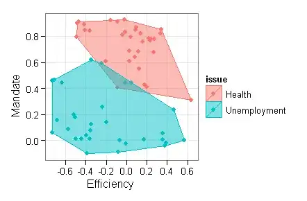
How do I add a neat polygon around a group of points on a scatterplot? I am using ggplot2 but am disappointed with the results of geom_polygon.
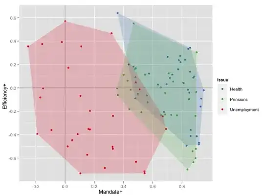
The dataset is over there, as a tab-delimited text file. The graph below shows two measures of attitudes towards health and unemployment in a bunch of countries:
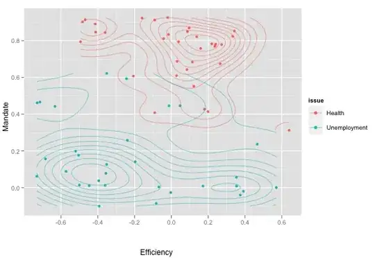
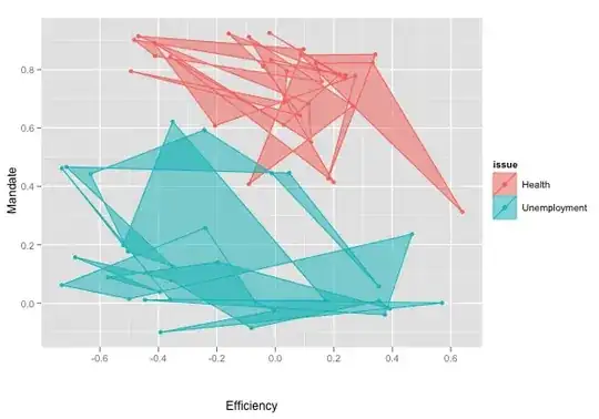
I would like to switch from geom_density2d to the less fancy but empirically more correct geom_polygon. The result on unsorted data is unhelpful:
How do I draw 'neat' polygons that behave as contour paths around the min-max y-x values? I tried sorting the data to no avail.
Code:
print(fig2 <- ggplot(d, aes(man, eff, colour=issue, fill=issue)) +
geom_point() + geom_density2d(alpha=.5) + labs(x = "Efficiency", y = "Mandate"))
The d object is obtained with this CSV file.
Solution:
Thanks to Wayne, Andy W and others for their pointers! The data, code and graphs have been posted to GitHub. The result looks like this: