The qualitative gestalt of your plots doesn't reveal any patterns. Take any of the strips of vertical points on the second plot, and turn it on its side mentally, and then stack up on top of each other the points that are piled up resulting in darker shades of blue, so that they no longer overlap. What do you see? A Gaussian distribution, right? You can prove this to yourself plotting histograms.
This is more apparent in the more populated levels of stress, just because the majority of subjects are not at the extremes, but the distribution of the residuals seems perfectly centered from low stress levels to high, spreading equally above and below the purple line.
Remember that the Gauss-Markov theorem of a BLUE OLS calls for zero mean residuals with equal variance.
I would recommend you this and this. And I recall that Glen_b has an awesome post on the topic somewhere in this site. I'll look for it, and include it... OK I may have confused it for another great answer he gave on QQplots, but you can check this one.
There was follow-up question:
If my regressor "stress" had not been linearly associated with my outcome, would I have seen it with my residuals vs. fitted values plot?
So I did what I usually do... go back to the drawing board... RStudio, that is.
I couldn't come up with anything too exciting, but still... Here we have a synthetic dataset where the dependent variable $y$ is linearly related by design to both $x$ and $z$, but the $z$ independent variable was squared $z^2$ before generating $y$. The actual equation was: $y = 5 + 75 * x + 5 * z + 50 * z^2 $. And yes, I know that the model is linear even with a polynomial relationship, as long as the coefficients don't contain the variables as some function. But just for illustrative purposes, I wonder if it's OK to proceed.
This is what the data look like before the regression:

Initially I fitted the model $\hat y =\hat \beta_0 + \hat \beta_1\times x + \hat\beta_2 \times z$. And these are some of the diagnostic plots:
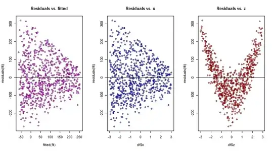
On the overall residuals v. fitted plot to the left the residuals are centered at zero, but their spread tapers to the right, suggesting heteroscedasticity. There isn't much additional information on the middle plot of these residuals against the $x$ variable, but there is a wealth of information on the final plot of residuals versus $z$, where a polynomial regression is strongly suggested.
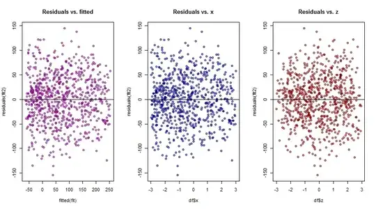
So I ran the polynomial model $\hat y =\hat \beta_0 + \hat \beta_1\times x + \hat\beta_2 \times z + \hat \beta_3 \times z^2$, yielding much better diagnostic plots:
Does this answer your question? I don't know, but it certainly illustrates the value of plotting the residuals against the different variables in multiple regression.


