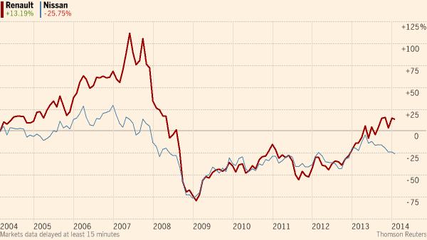
In the financial press, a common way to display two or more time series (such as GDP or - relevant to the original question - stock prices) in a way that allows changes over time to be compared, is rebasing. A base time is selected, and the values of the series are scaled so that they are all 100 there. If the first series is €40 in the base period, but €48 later, these become 100 and 120 (which indicates a 20% rise since the base period). If the second series was €500 in the base period and €450 later, these become 100 and 90 (showing a 10% fall). Here is an example in the Economist (in case that is paywalled, this is link to the image itself).
Alternatively, just the percentage changes might be shown. So in my example, the first series would start at 0 and move up to 20, while the second series will start at 0 and move down to -10. Here is an example from the Financial Times (image link).
Usually the first time included in the graph, on the far left, is chosen as the base period. Occasionally we see plots rebased so the final value is 100, like this one (taken from this BBC article). I've also seen charts which have been rebased to a period in the middle of the graph. This might make sense if you were comparing GDP series for two countries before and after a financial crisis - to make the results comparable you might rebase them to the period with the peak pre-crisis GDP. Note that the faster-growing economy in the run-up to the crisis will have a steeper graph to the left of the crisis, but this means its graph will dip below the one it is being compared to. To someone who doesn't understand how to interpret the vertical scale of the graph, this might suggest it is the weaker economy prior to the crisis! This sort of confusion is avoided by rebasing to the left, but that is not always appropriate.
There are some advantages to just plotting the ratio of the two series. One is that it is possible to extend this concept to more than two series on the same graph (see this example from BBC - taken from this article).
But beware of the disadvantages of rebasing - the choice of the base period is important, because it makes the series arbitrarily cross there. Generally people rebase so that the graphs all start together at 100, and the series will appear to cross over again if they ever return to their "original" ratio. But unless there is a very good reason to start the graph of the series there - perhaps because the stock price graph begins at flotation, or a GDP graph begins at national independence - then the starting point doesn't really represent anything genuinely original or special. If you'd made a different choice about where in the data series you start the graph from, then features like subsequent cross-overs can look quite different. This kind of arbitrary crossing-over is one reason that people are skeptical of charts with two separate y-axes for two time series. I would also second Peter Flom's answer, that it is easier to interpret one line than two, so if only the ratio of the two series is interesting, then only the ratio of the series need be plotted!