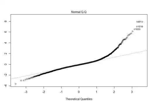
Hey guys, I am researching a social science topic on fertility rate per county. However when I finish my linear model and begin to plot my QQ plot, I got a curve that is curving up. Is it a heavy tailed one?
Asked
Active
Viewed 549 times
0
-
1See the answer [here](http://stats.stackexchange.com/questions/101274/how-to-interpret-a-qq-plot/101290#101290) – Glen_b Apr 26 '16 at 02:03
-
So it's heavy tailed. right? – Kristian Richthoffen Apr 26 '16 at 02:05
-
1I'd describe it first as right skewed. On the left it is mildly heavy-tailed. Below about -1/2 the relationship is straight with slope close to 1, which suggests the left tail is close to normal, but with a larger standard deviation than that in the middle (between -1/2 and 1/2 on the actual quantiles) where the peak is sharper (the standard deviation is smaller). Above that there's a distinct curve pulling the tail far up on the right, which dominates the impression of shape. So right skew, somewhat heavy tailed/peaky. – Glen_b Apr 26 '16 at 03:39
1 Answers
1
It looks both heavy tailed and somewhat skewed to me. I think the best way to use a qq-plot is just to see if the distribution looks normal overall (follows the line). Then you can interpret the shape with other visualizations such as histograms and density plots.
gung - Reinstate Monica
- 132,789
- 81
- 357
- 650
-
1Seems worth noting that fertility data may be naturally right skewed owing to the impossibility of going below zero while large variables compared to the mean may easily be found. – Robert de Graaf Apr 26 '16 at 04:49
