0

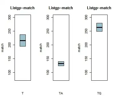
I am trying to interpret the three boxplots below in light of another plot before finalizing my glmer models (GLMM) in R.

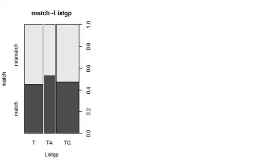
The boxplots below show the relationship between a listener's group (T, TA and TQ) and whether the listeners would match a selection or mismatch it to a predicted response (the DV match is binary: match/mismatch).

Both Listgp and match are factors; thus, I first used the xtabs function, then plotted the boxplots.

My basic model is as follows.

glmer<-(match~Listgp + (1|stimulus) + (1|listener), data= msba, family= "binomial")

Now, first, I notice that there are no whiskers in the upper and lower quantiles. I read somewhere that this means that the bottom and the top of the box would be at the exact position of the lower and upper quantiles. Is this the case here too?

Second, I am trying to interpret these boxplots in light of the plot that follows them which is straightforward for me.

In the boxplots, the range of variance for the T group is bigger than the TQ or the TA. In addition, the TQ group seems (according to the boxplots) to be matching the patterns more, followed by the T and finally the TA.

On the other hand, according to the plot, the TA group matches the patterns more than the TA and the TQ. Basically, the TA mismatches the patterns more than the two other groups.

So my question is, do the two plots give the same or different information and is my above interpretation correct?

enter image description here

enter image description here

The first 6 lines of the data are as follows.

head(msba)
  list.Listgp   cond.by gender age level.of.ed. Avg.skills.T read.A comp.A speak.A
1    T1      T Qualtrics   Male  29      college           10     NA     NA      NA
2    T1      T Qualtrics   Male  29      college           10     NA     NA      NA
3    T1      T Qualtrics   Male  29      college           10     NA     NA      NA
4    T1      T Qualtrics   Male  29      college           10     NA     NA      NA
5    T1      T Qualtrics   Male  29      college           10     NA     NA      NA
6    T1      T Qualtrics   Male  29      college           10     NA     NA      NA
  writ.A   st.    match st.length st.context st.nature freq.
1     NA  man     match     short      plain      Real  7.80
2     NA Dhabb mismatch     short   emphatic      Real 50.02
3     NA   qad mismatch     short          q      Real 96.57
4     NA   ?an    match     short pharyngeal      Real 15.78
5     NA   min mismatch     short      plain      Real 59.07
6     NA dhidd mismatch     short   emphatic      Real 54.50

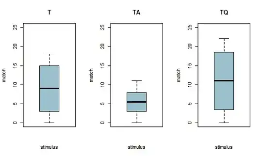
I plotted other boxplots but this time with the variable stimulus (which is also is a factor). These ones have whiskers! (Because I don't have enough reputation points, I will have to remove the 2nd plot so that I can paste the boxplots with stimulus)

boxplot-stimulus~match/listgp

mosaic plot

I used these codes for the xtabs.

monosbaT.xtabs <- xtabs(~ match + st. , data = monosbaT)
monosbaTA.xtabs <- xtabs(~ match + st., data = monosbaTA)
monosbaTQ.xtabs <- xtabs(~ match + st., data = monosbaTQ) 

Then, in the lattice package I plotted them using these codes.

par(mfrow = c(1,3))
boxplot (monosbaT.xtabs, main = "T", legend.text= c("match", "mismatch"), xlab= "stimulus", ylab= "match", col= "lightblue3", ylim=c(0, 25), breaks=seq(0, 25, 8))
boxplot (monosbaTA.xtabs, main = "TA", legend.text= c("match", "mismatch"), xlab= "stimulus", ylab= "match", col= "lightblue3", ylim=c(0, 25), breaks=seq(0, 25, 8))
boxplot (monosbaTQ.xtabs, main = "TQ", legend.text= c("match", "mismatch"), xlab= "stimulus", ylab= "match", col= "lightblue3", ylim=c(0, 25), breaks=seq(0, 25, 8)) 
par(mfrow =c(1,1))

My dataset has 1224 obs. of 17 variables.
Nick Cox
  • 48,377
  • 8
  • 110
  • 156
Shad
  • 141
  • 7
  • Showing no whiskers can mean (a) a non-standard box plot (b) a very small sample size (c) ties, so that minimum ties with lower quartile and maximum ties with upper quartile. (NB qua**r**tiles specifically here, not qua**n**tiles.) If you can post example data, all should become clear. – Nick Cox Apr 13 '16 at 10:35
  • I don't understand your data. If `match` is a factor, why does it have values in the hundreds? Why are box plots interesting at all for factors? I wonder whether you are somehow inputting frequencies of different groups, and there are three frequencies in each box plot, hence the result you get. (I am not fluent in R.) – Nick Cox Apr 13 '16 at 10:42
  • In fact, you do say clearly that `match` is binary. So, those numbers between 100 and 300 can only be something else. So, I add tentatively to the suggestions above (d) the boxplot is based on values that aren't appropriate. – Nick Cox Apr 13 '16 at 10:48
  • Thanks Nick for all your comments. What sort of data should I provide? Will the first 6 lines of the data do? – Shad Apr 13 '16 at 10:52
  • I think we need enough information to know how these box plots were produced. I am close to the conclusion that you need quite a different graph. But the box plots all seem to be showing just three distinct values, so what are they? – Nick Cox Apr 13 '16 at 10:55
  • I agree with you that it's weird for match to have values in the hundreds but that's the only way which seems to work for when I use values between 0 and 1, no boxplot shows up! – Shad Apr 13 '16 at 10:57
  • When I plot match for the three groups against another variable such as stimulus, I get normal looking boxplots. I'll try to attache these to the post above. – Shad Apr 13 '16 at 10:59
  • But a box plot of 0 1 data will typically just show 0 and 1 as distinct values. If the majority are 1, then the median and upper quartile are 1. If the majority are 0 then the median and the lower quartile are 0, and so forth. A box plot isn't meaningless for 0 1 data, but it's fairly useless. There is one exception: equal frequencies of 0 and 1 imply a median 0.5. (Similar comments apply to coding with any other two integers.) – Nick Cox Apr 13 '16 at 10:59
  • There's no scope for weirdness here: either a box plot is a sensible thing to do, in which case you can interpret it, or you need some other graphic(s). In fact your mosaic plot looks good: I'm just still struggling to know what the box plots show. How many people in the dataset? What code did you use for the boxplots (I don't guarantee to understand it, but someone else will)? – Nick Cox Apr 13 '16 at 11:05
  • Ok, I think now I understand why the values are in hundreds. Since I am plotting xtabs, the values are of actual tokens in each the of listener groups' tables. So basically, these values are frequencies of match and mismatch. – Shad Apr 13 '16 at 11:27
  • Thanks for the code. As I warned I am not fluent in R, and use it about once a year, and have never used those functions; but I think you are feeding a cross-tabulation of frequencies to a box plot routine. That was an earlier guess. I don't think that is going to help you think about the data at all. – Nick Cox Apr 13 '16 at 11:27
  • Indeed I am using crosstabs! So, how else can I think about the data other than using the mosaic plot, or is that enough? – Shad Apr 13 '16 at 11:29
  • This is closed now. I originally voted to close this as a duplicate, but now think that the problem is just misapplication of box plots. I think you now need a complete new thread, because no-one could now post an answer and this set of comments is already excessively long by site standards. – Nick Cox Apr 13 '16 at 11:29
  • Ok Nick. Thanks for all of your input. This has been very helpful. I will create a new thread then. – Shad Apr 13 '16 at 11:32

0 Answers0