Are the following set of values normally distributed? 26, 33, 65, 28, 34, 55, 25, 44, 50, 36, 26, 37, 43, 62, 35, 38, 45, 32, 28, 34
Clearly not; they're integers.
[More properly, it's not a set of observed values that's normally distributed (the ECDF of a set of $n$ known values is discrete, the values themselves are bounded and so on); normality is an attribute of a population distribution from which an observed sample might have been drawn. But not this one.]
However, while it's often clear we cannot have a sample from a normal distribution for one reason or another, rarely is it interesting to ask whether the sample came from a normal distribution. A more relevant question is whether it might be a suitable approximation -- but to answer that question you need to know more about what you're doing, what impact the non-normality you have might have on it, and what your tolerance for that impact might be (or your audience's tolerance, perhaps).
(One thing worth noting about the shape can be seen from a QQ-plot -- or any number of other displays, depending on what you're used to using to investigate distributional shape. You should show a suitable display and interpret it. The display you show -- which is not a histogram in spite of being labelled as one -- is not really suitable, since it disguises the relative gaps in the data. It appears to be treating the x-axis values as a set of ordered category labels rather than something where the number indicates position.)
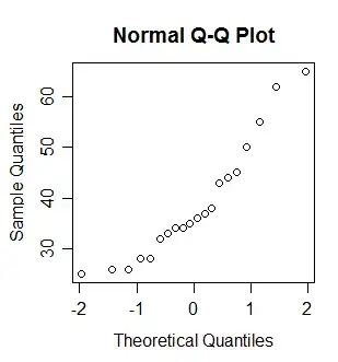
Q-Q plot of the data indicates skewness
We know that a normally distributed set of observations has no skewness at all
I sure don't know that; in fact I know it's untrue -- a sample from a normal distribution can certainly be somewhat skewed, just by random variation. It's the population that has no skewness at all.
But your conclusion -- that the data indicate skewness -- is correct, it's just much harder to see in in that chart in your question.
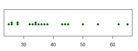
Here's a dotplot, which does a better job than the bar chart. An actual histogram should be adequate. (If there was more data, I'd look at something else -- with separate thin bars representing relative frequency, as your display has, but with the x-position representing the values, akin to a histogram. In R you get this with plot(table(x)), but for very small samples like this with few repeated values I prefer the dotplot.)
Do we need to transform the data-set into normally distributed values before calculating the mean, standard deviation and the z scores?
What could you conclude from the mean (etc) of transformed data?
...since in real world situations, data-sets may not be normally distributed
In real world situations, you don't really have normal distributions, except in a few special situations.
then how do we go ahead to perform statistical tests on them.
Not all tests assume normality
Even for those that do, the assumption of normality is not always very important (sometimes it may matter only a little, sometimes it might matter a lot -- it can depend on the test and on the sample size).
Transformation is frequently not the first thing you should think about doing. You should first really pay attention to what questions you need to ask of the data (what do you need to find out?). Then you can worry about what might be suitable ways to do that. It might involve transformation, but it might much better involve something else.
What are you interested in finding out from these data? If you don't know, why would you transform first? It might have no value in answering the questions of interest.


