I find there is a difference between "in the limit" and "in the real world". Part of the "in the real world" is that there is variation around every estimate.
"In general" does not necessarily mean not "in the real world". My point is that each type of distribution and each sampling approach is going to give results that are different from the "in the limit" approach. For more entry-level folks looking for the "how do I do it myself" and "what does it look like applied to my case" this might give a way forward.
The analytic expression is useful in the presence of many samples. It can be less than informative in the presence of fewer samples.
The following code does this:
- It draws samples from the same distribution, but it draws two different sample sizes.
- It computes the summary metric, in this case the minimum.
- It iterates (repeats) this many times
- We then look at how the summary varies by sample size.
Here is the code:
library(timeSeries) #for col stats
library(vioplot)    #for violin plot

#parameters
set.seed(220)  #for reproducibility

N <- 2000 #number of runs

n1 <- 5   #n samples in first set
n2 <- 500 #n samples in 2nd set

##initialize data
mystore <- as.data.frame(matrix(0,nrow = N, ncol=2))
names(mystore) <- c("fewSamples","manySamples")

##iterate
for (i in 1:N){

     ## different ways to work distributions
     # (note) what you do to y1 you must also do to y2 to be consistent
     #
     # rnorm(n1) #standard
     # rnorm(n1,mu=2,sd=2) #change mean and standard dev
     # rexp(n1) #exponential distribution with defaults
     # rexp(n1,rate=2) #exp dist with particular rate

     #draw first set of samples (few)
     y1 <- rnorm(n1)

     #draw
     y2 <- rnorm(n2)

     #find minimum values
     mystore[i,1] <- min(y1)
     mystore[i,2] <- min(y2)
}


##plot the results

# scatterplot with violins
plot(mystore,xlim=c(-5,1),ylim=c(-6,-2))
vioplot(mystore[,1], col="tomato", horizontal=TRUE, at=-5.5, add=TRUE,lty=2, rectCol="gray")
vioplot(mystore[,2], col="cyan", horizontal=FALSE, at=-4.5, add=TRUE,lty=2, rectCol="gray")

#violin plots
vioplot(mystore[,1],mystore[,2],
        names = names(mystore),
        col=c("Green","Blue"))
grid()

#print the results
colMeans(mystore)   #central tendency
colSds(mystore)     #tendency of variation

#if they were equal this would be zero centered, and unit variances would add
summary(mystore[,2]-mystore[,1])
My text results were:
> colMeans(mystore)   #central tendency
 fewSamples manySamples
  -1.166429   -3.039060

> colSds(mystore)     #tendency of variation
 fewSamples manySamples
  0.6445135   0.3698300

> #if they were equal this would be zero centered, and unit variances would add
> summary(mystore[,2]-mystore[,1])
   Min. 1st Qu.  Median    Mean 3rd Qu.    Max.
-4.4190 -2.3730 -1.8700 -1.8730 -1.3910  0.7731
The mean, what you would expect if you took the minimum of 5 samples, is much smaller than the minimum you would expect if you took 500 samples. It is less than half of the value. The variation is much larger for the few samples, than for the many. Someone might say "this should be obvious" or "this should be intuitive" but if you haven't cultivated the intuition yet, then it isn't. If you haven't cultivated it yet, then experiments like this are ways to train it.
This first plot shows the raw points in scatterplot, and has overlaid violin plots indicating that central tendency and tendency of variation differ substantially given sample size. (n1,n2)
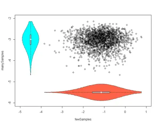
The second puts the violins side by side. The interior boxplots and violins also give a slight sense that skew is different for the distributions.
To apply this approach other distributions, or distributions with other parameters substitute the lines where the "draw" occurs.
UPDATE:
(Im working slowly on moving this to a new question, per request by a super-user.)
I think @Andy_W had an excellent point about the black swans. Here are links to Naseem Taleb, the book on Amazon, and the Wikipedia. The weaker version is a "grey swan" and the crazy fast-zombie big brother is the "dragon king" and are discussed in "silent risk".

