A very reasonable thing to do to just get a sense of "this is probably better," rather than any kind of formalized hypothesis test or anything, is to just plot the performance of the two methods over time.
Here's an example of a similar kind of plot from one of my papers:
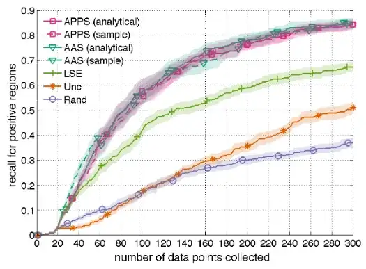
Here the problem setting is slightly different, but you can think of the horizontal axis as being roughly time and the vertical as being roughly solution quality; lines are the mean of 10 runs, transparent fills are the standard errors. This is a quick check that clearly the four "APPS"/"AAS" methods are about the same, "LSE" is somewhat worse, and "Unc" and "Rand" are considerably worse. It also allows us to see that "Unc" starts off somewhat slower compared to "Rand", but "Rand" levels off more quickly.
When the amounts vary more, and especially if you're comparing fewer methods, it might be more informative to plot, say, 10%, 50%, and 90% quantiles rather than means + standard errors. There are also methods like "functional boxplots" that can be helpful.