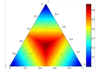
I have trouble reading the following simplex heatmap.
Description of the figure: Consider a three-label classification problem. Simplex corners indicate where one label has very high probability, with the opposite edge showing the probability range for the other two classes when that label has very low probability. Simplex centers represent a uniform posterior distribution.
I understand that the three sides are analogous to three axes (one for each label), and that, say, at the bottom-right vertex, the probability of one label is 1 while the probability of others is 0. However, I can't figure out how to interpret a point in the interior or on an edge of the simplex. For example, what are the values of the three probabilities for a point on the mid-point of the left edge, or for the point at the intersection of the dotted line originating at 0.2 on base and that originating at 0.8 on the left edge.
My failure to visualize this representation seems to be stemmed from the fact that 3-dimensional data is represented in 2 dimensions, that too with non-orthogonal axes.
Image taken from Active Learning Literature Survey
P.S. For now, ignore the actual heatmap (i.e. the intensity of color at some point). Also, I am not sure if this question should be asked here or at Maths-StackExchange
