1

I am not a statistician. But I've ended up working on a product that needs some statistics. Hopefully I can explain my question well enough.

Let's say I run a store that sells shirts. Small, Medium, Large, Extra Large, and Extra Extra Large. S, M, L, XL, and XXL. And I sell all different shirts. Red ones, blue ones, all sorts of colors.

For the entire store, I track which sizes are selling. So data something like this:

S:   15%
M:   50%
L:   20%
XL:  10%
XXL: 5%

And I also have that data for each color of shirt. Blue shirts sell 20% small, 60% medium, ect.

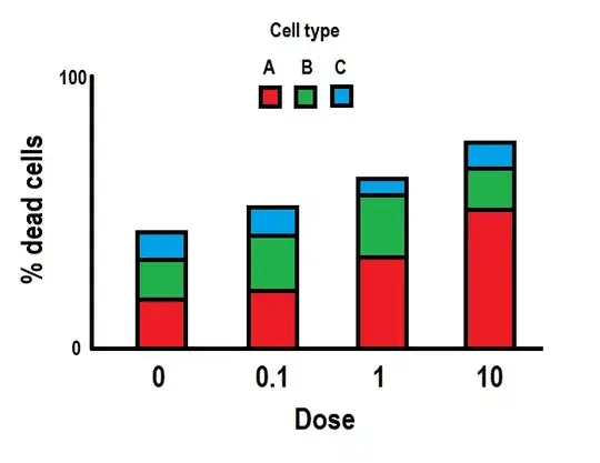
What I want to accomplish is a graph like this:

The kind of graph I want

Where each bar is a size. I want to be able to do these calculations for whatever color, or set of colors I want. The goal is to communicate if a shirt is (un)popular among certain sizes, compared to the average.

So basically, how do I compare two percentages in a way that can give me the length of that bar?
kjetil b halvorsen
  • 63,378
  • 26
  • 142
  • 467
fnsjdnfksjdb
  • 119
  • 1
  • Do you want to compare 1 color to another (controlling for size), 1 size to another (controlling for color), or sizes & colors combined over time (sales for December compared to November)? – gung - Reinstate Monica Jan 04 '16 at 18:35
  • I want to compare one color to the average of all sales. – fnsjdnfksjdb Jan 04 '16 at 18:41
  • 1
    So I can see if a color is selling more in a size than the average shirt. Maybe it's a correlation I'm looking for? Does blue correlate with large, and to what degree? – fnsjdnfksjdb Jan 04 '16 at 18:55
  • Your data could be shown in a two-way table (size by color) and thus also plotted on any equivalent graph. The fact that one variable is ordered and the other isn't doesn't bite here. See e.g. http://stats.stackexchange.com/questions/56322/graph-for-relationship-between-two-ordinal-variables http://stats.stackexchange.com/questions/148554/how-can-you-visualize-the-relationship-between-3-categorical-variables – Nick Cox Jan 04 '16 at 19:05
  • I actually only need to show one color, or an overall set of colors at a time. So the average percentages are 15, 50, 20, 10, and 5. This group sells 30, 30, 30, 10, and 0. How can I calculate the "size of the difference" or something for each size? – fnsjdnfksjdb Jan 04 '16 at 19:27
  • Maybe I should mention that the reason I think I need to do it this way is that my actual numbers aren't about t-shirts, and the "size" equivalent has some very small categories. Displaying the data directly makes it very hard to see changes in those tiny slivers. I think I visualization like the one I mentioned could show the differences, assuming everyone kinda knows the baseline. – fnsjdnfksjdb Jan 04 '16 at 19:29
  • So color is a red herring, so to speak. I suggest you rewrite the question accordingly. I now don't understand what you're asking, as your graph appears to be an answer to your own question. – Nick Cox Jan 04 '16 at 20:00

1 Answers1

1

Mosaic plot or correspondence analysis plots. Check those out.

P.S. - I sent you to the SAS item on correspondence analysis because the wikipedia entry is weak on showing the graphical uses of the technique. But the technique is available in many packages.

StatNoodle
  • 659
  • 3
  • 6