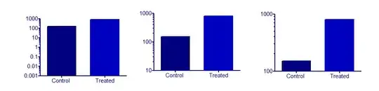
I'd separate the problem of log axes from the problem of bar charts.
Logarithmic axes IMHO are best suited for things that come or happen in multiples (... increased by a factor of 20 when treated with ...).
In that case, 1 = 10⁰ is the natural origin. There is a whole range of physical/chemical values which are in fact logarithmic, e.g. pH or absorbance $A = lg I_0 - lg I$, and which have "natural" origins. For A that would be $I_0$. For pH in aqeous solutions, e.g. 7.
Bar charts can never be sensible if there is no sensible and fixed origin which takes the role of a control (baseline, blank). But this doesn't have anything to do with the log axes.
The only regular use I have for bar charts are histograms. But I could imagine that they do well to show the difference to this origin (you also immediately see whether the difference is positive or negative). Because the bars depict an area, I tend to think of barcharts as a very discretized version of area under a curve. That is, the x-axis should have a metric meaning (which may be the case with time, but not with cities).
If I'd find myself wondering what origin to use for the log of something that had a "natural" origin at 0, I'd step back and think a bit about what is going on. Very often, such problems are just an indicator that the log is not a sensible transformation here.
Now a bar chart with log axes would emphasize increases or decreases that happen in multiples. Sensible examples that I can think of right now all have some linear relationship to a value of interest. But maybe someone else finds a good example.
So I think the data transformation should be sensible with respect to the meaning of the data at hand. This is the case with the physico-chemical units I mentioned above (A is proportional to concentrations, and pH has, for example, a linear relationship to the voltage in a pH-meter). In fact, it is so much the case, that the log unit gets a new name, and is used in a linear way.
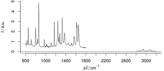
Last, but not least, I come from vibrational spectroscopy, where broken axes are quite regularly used. And I consider this use one of the few examples where the breaking of the axes isn't deceiving.
However, we don't have changes in the order of magnitude. We just have an uninformative region of 30 - 40 % of our x range: Here's an example:
 For this sample, the part between 1800 - 2800 /cm cannot contain any useful information.
The uninformative spectral range is therefore removed (which also indicates the spectral ranges we actually use for chemometric modeling):
But for the interpretation of the data, we need precise readings of the x-position. But generally we do not need multiples that span the different ranges (i.e. there are such relations, but most connections are more complicated. E.g.: Signal at 3050/cm, so we have unsaturated or aromatic substance. But no strong signal at 1000/cm, so no mono, meta, nor 1,3,5-substituted aromatic ring ...)
So it is better to depict x with a larger scale (actually we often use millimeter-sheet like guides or label the exact locations). So, we break the axis, and get a larger x scaling:
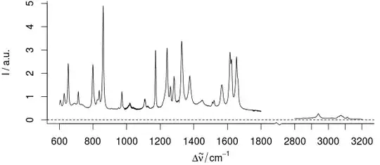
Actually, it is very much like facetting:

but the broken axis IMHO emphasizes that the scale of the x-axis in both parts is the same. I.e. Intervals within the plotted regions are the same.
To emphasize small intensities (y-axis), we use magnified insets:
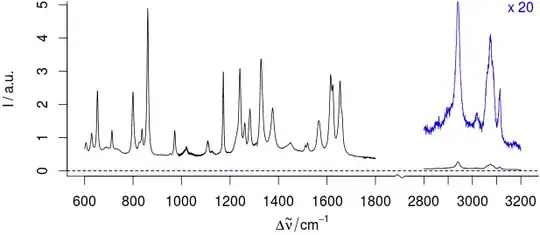
[... For details, see the magnified (x 20) νCH region in blue ....]
And this is certainly possible with the example in the linked plots as well.