I am trying to apply Fisher's exact test in a simulated genetics problem, but the p-values appear to be skewed to the right. Being a biologist, I guess I'm just missing something obvious to every statistician, so I would greatly appreciate your help.
My setup is this: (setup 1, marginals not fixed)
Two samples of 0s and 1s are randomly generated in R. Each sample n = 500, probabilities of sampling 0 and 1 are equal. I then compare the proportions of 0/1 in each sample with Fisher's exact test (just fisher.test; also tried other software with similar results). Sampling and testing is repeated 30 000 times. The resulting p-values are distributed like this:
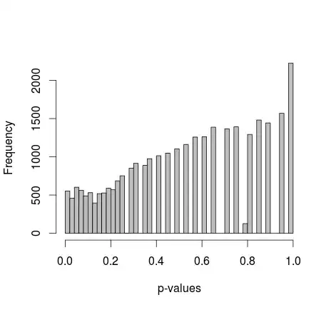
Mean of all the p-values is around 0.55, 5th percentile at 0.0577. Even the distribution appears discontinuous on the right side.
I've been reading everything I can, but I don't find any indication that this behavior is normal - on the other hand, it's just simulated data, so I see no sources for any bias. Is there any adjustment I missed? Too small sample sizes? Or maybe it's not supposed to be uniformly distributed, and the p-values are interpreted differently?
Or should I just repeat this a million times, find the 0.05 quantile, and use that as the significance cutoff when I apply this to actual data?
Thanks!
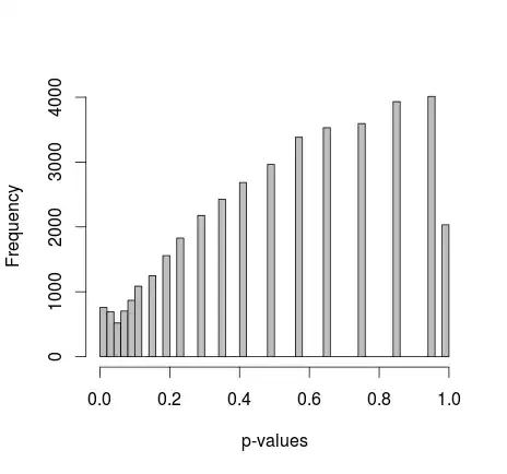
Update:
Michael M suggested fixing the marginal values of 0 and 1. Now the p-values give a much nicer distribution - unfortunately, it's not uniform, nor of any other shape I recognize:
adding the actual R code: (setup 2, marginals fixed)
samples=c(rep(1,500),rep(2,500))
alleles=c(rep(0,500),rep(1,500))
p=NULL
for(i in 1:30000){
  alleles=sample(alleles)
  p[i]=fisher.test(samples,alleles)$p.value
}
hist(p,breaks=50,col="grey",xlab="p-values",main="")
Final edit:
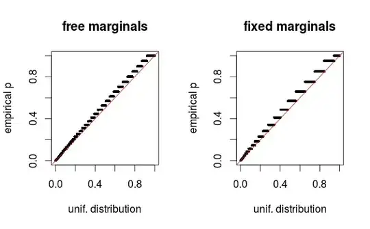
As whuber points out in the comments, the areas just look distorted due to binning. I am attaching the QQ-plots for the setup 1 (free marginals) and setup 2 (fixed marginals). Similar plots are seen in Glen's simulations below, and all these results in fact seem rather uniform.
Thanks for the help!