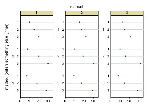
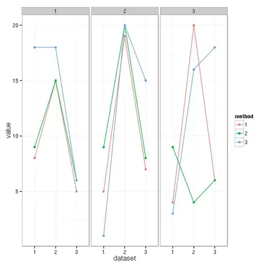
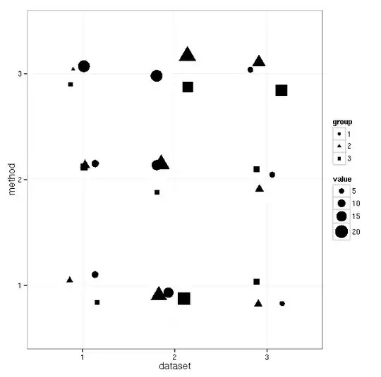
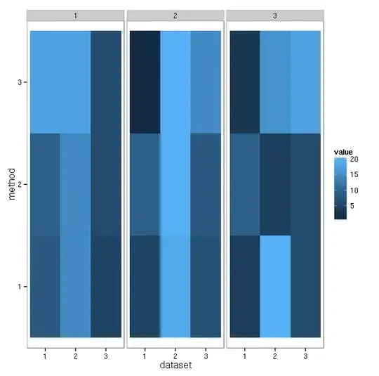
I have multi-dimensional data in the following form:
|          |              1              |              2              |              3              |
|----------|:-------:|:-------:|:-------:|:-------:|:-------:|:-------:|:-------:|:-------:|:-------:|
|          | Method1 | Method2 | Method3 | Method1 | Method2 | Method3 | Method1 | Method2 | Method3 |
| Dataset1 |    10   |    8    |    7    |    15   |    20   |    18   |    20   |    30   |    28   |
| Dataset2 |    15   |    10   |    9    |    17   |    19   |    17   |    22   |    30   |    29   |
| Dataset3 |    13   |    10   |    8    |    15   |    16   |    15   |    21   |    32   |    29   |
Is there a way to intuitively visualize this data for comparing the three methods for each dataset, for the different values of 1,2,3? What is the name of the proposed chart (so than I can look it up in R or Excel or Matlab documentation)?
I am not sure what this kind of data is called, so pardon my possibly wrong tags.