15

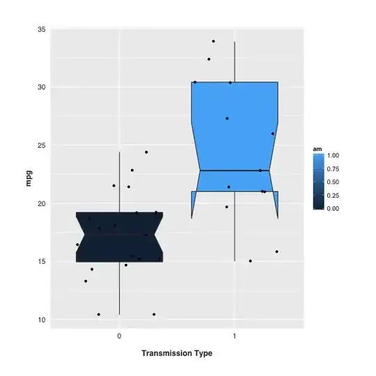
While doing some EDA I decided to use a box plot to illustrate the difference between two levels of a factor.

The way ggplot rendered the box plot was satisfactory, but slightly simplistic (first plot below). Whilst researching the characteristics of box plots I started experimenting with notches.

I understand notches display the CI around the median, and that if two boxes' notches don't overlap there's ‘strong evidence’ – at a 95% confidence level – that the medians differ.

In my case (second plot), the notches don't meaningfully overlap. But why does the bottom of the box on the right hand side take that strange form?

Plotting the same data in a violin plot didn't indicate anything unusual about the probability density of the corresponding violin.

fig.1 boxplot

fig.2 notched boxplot

lofidevops
  • 111
  • 4
RDJ
  • 485
  • 1
  • 4
  • 14
  • 1
    In your ggplot code you should use fill=factor(am) since currently am is being used as a numeric variable. – rnso May 11 '15 at 17:41
  • That's a great spot @rnso – RDJ May 11 '15 at 18:30
  • Can anyone post the original data? I guess they are from a standard sand box for `ggplot2`. I like the idea of plotting the individual data points too but it's frustrated in so far as points within the dark box are made invisible. – Nick Cox Mar 04 '20 at 16:51

1 Answers1

20

In my case (second plot), the notches don't meaningfully overlap. But why does the bottom of the box on the right hand side take that strange form? How do I explain that?

It indicates that the 25th percentile is about 21, 75th percentile about 30.5. And the lower and upper limits of the notch are about 18 and 27.

A common reason is that your distribution is skewed or sample size is low. The notch's boundary is based on:

$median \pm 1.57 \times \frac{IQR}{\sqrt{n}}$

If the distance between median and the 25th percentile and the distance between median and the 75th percentile are extremely different (like the one at the right) and/or the sample size is low, the notch will be wider. If it's wide enough that the notch boundary is more extreme than the 25th and 75th percentiles (aka, the box), then the notched box plot will display this "inside out" shape.

Penguin_Knight
  • 11,078
  • 29
  • 48
  • 1
    Thanks a lot for your detailed explanation. Let me ask, why the lower and upper limits of the notch is about 17 and 24, not about 18 and 27 (on the right boxplot)? – Denis Feb 20 '20 at 18:04
  • @Denis, Thanks for catching that. I have revised it. – Penguin_Knight Mar 04 '20 at 15:09