4

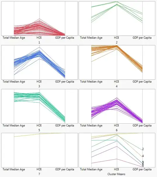
Suppose a person can be defined with 3 variables (each in the range 0-1000) which then lead to an output label Y. I have 20-40 labels.

What is a good visualization to show the flow of people to Y based on the combined effect of values in each of the three variables.

Individually for each variable, I can show then using an Alluvial Plot. Is there a way in which I can show a flow diagram on how values in all three variables lead to different Y Labels?

A many to many alluvial plot or something which does similar?

I guess alluvial plot wouldn't be the correct term as the values are not changing over time I guess. I maybe wrong.

Harsh Nisar
  • 125
  • 5

1 Answers1

7

I'm not sure "flow" can be applied for continuous factors, but parallel coordinates may give you the effect you're looking for. Here is a grid of clustering output showing each cluster as a separate graph, plus one more for the mean of each cluster.

enter image description here

Putting them all in one graph with the Y as a fourth variable is more like what you were asking, but the cluster axis is artificial and 20-40 categories is too many for coloring.

enter image description here

Update from comments: This kind of grid of parallel coordinates plots is part of the output for JMP's K-means clustering analysis. In case you have JMP and want to experiment, here's a script for the analysis that I took the first picture from.

Open("$SAMPLE_DATA/World Demographics.jmp");
K Means Cluster(
    Y( :Total Median Age, :HDI, :GDP per Capita ),
    {Number of Clusters( 7 ), Go( Parallel Coord Plots )}
);
xan
  • 8,708
  • 26
  • 39
  • I always appreciate reading your answers, @xan. I assume you are creating these in SAS. How difficult is the code to produce them? If it's not too long, you could add it, if you'd like; there's a good bit of R code on CV--I'd hate it if it seemed like CV was unfriendly to SAS. – gung - Reinstate Monica Apr 27 '15 at 17:45
  • Excellent graph, but would be even better with informative text rather than 1 to 7 (for groups of countries, presumably). 1 = Africa 7 = Oceania??? – Nick Cox Apr 27 '15 at 17:51
  • Thanks, @gung! I'm normally using JMP, the product of SAS that I work on. JMP has a scripting language though its strength is interactive exploration. I'll add a script here, and keep it in mind for future answers, though I don't want to come across as pushing JMP. – xan Apr 27 '15 at 17:55
  • Thanks, @NickCox. Yes, names would be better. I lazily used the output of a K-means cluster for the categories and kept the default names for the clusters. – xan Apr 27 '15 at 17:58
  • Got it. In that case the clusters need not have names that are already in use. – Nick Cox Apr 27 '15 at 18:01
  • @xan, it is probably best that you do not *promote* SAS or JMP here. But your addition does not strike me as promotion. I think this may add to the usability of your answer, thanks again. – gung - Reinstate Monica Apr 27 '15 at 18:08