I am trying to visualise the size of the impact of different activities (A,B,C,D etc.) that improve (reduce the size of) a certain situation. Some of the activities (e.g. B and C) overlap with other activities (e.g. A) in their impact. That is, one activity´s impact is reduced by another activity as both impact the same situation.
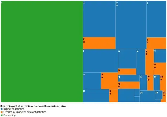
I planned to visualise this with a treemap. But it seems that software automatically generating treemaps cannot display more than one layer (see diagram attached). Therefore, I thought a Venn diagram might be most suitable. But I read in another question posted here that only very few sets of data can be displayed in Venn diagrams. However, I want to display around 20 activities (and in this case circles) in one diagram, some of them intersecting, some not.
Is anyone familiar with a software for Venn diagrams that is able to display relatively large sets of data (or different layers in treemaps)? Or does somebody have an entirely different approach to the visualisation of my data?
I very much appreciate helpful comments, ideas and experiences!