I am trying to draw a plot of the decision function ($f(x)=sign(wx+b)$ which can be obtain by fit$decision.values in R using the svm function of e1071 package) versus another arbitrary values.
From svm documentation, for binary classification the new sample can be classified based on the sign of f(x), so I can draw a vertical line on zero and the two classes can be separated from each other. I’ve used the example form here.
require(e1071)

# Subset the iris dataset to only 2 labels and 2 features
iris.part = subset(iris, Species != 'setosa')
iris.part$Species = factor(iris.part$Species)
iris.part = iris.part[, c(1,2,5)]

# Fit svm model
fit = svm(Species ~ ., data=iris.part, type='C-classification', kernel='linear')
> head(fit$decision.values)
   versicolor/virginica
51           -1.3997066
52           -0.4402254
53           -1.1596819
54            1.7199970
55           -0.2796942
56            0.9996141
...
Tabulate actual class labels vs. model predictions:
> table(Actual=iris.part$Species, Fitted=pred)
            Fitted
Actual       versicolor virginica
  versicolor         38        12
  virginica          15        35
Plot of decision function
fit$decision.values
plot(fx,fy,pch=rep(c(3,1),c(50,50)),col=rep(1:2,c(50,50)))
abline(v=0)
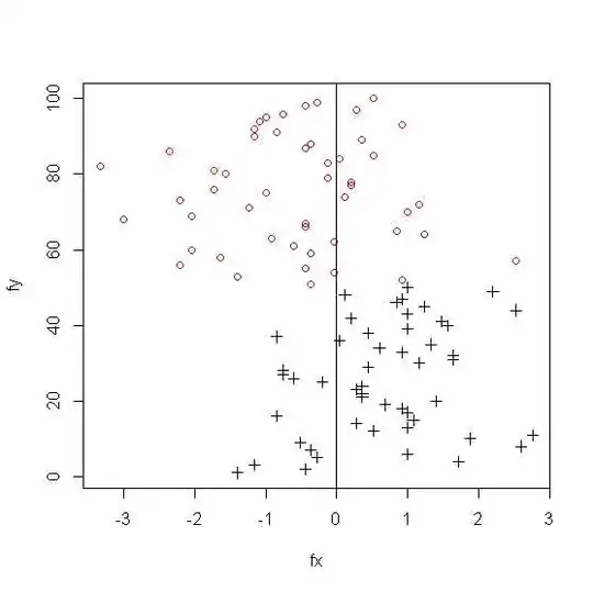
It can be seen that there is 15 and 12 misclassified example in class 1 and class 2 respectively.
The resulting plot for 3 class svm ;
But not sure how to deal with multi-class classification; can anyone help me on that? Is there any way I can draw boundary line that can separate $f(x) $ of each class from the others and shows the number of misclassified observation similar to the results of the following table?
>fit = svm(Species ~ ., data=iris, type='C-classification', kernel='linear')
>pred = predict(fit, iris)
Tabulate actual class labels vs. model predictions:
> table(Actual=iris$Species, Fitted=pred)
            Fitted
Actual       setosa versicolor virginica
  setosa         50          0         0
  versicolor      0         46         4
  virginica       0          1        49